

Modern web design for the law office of John F. Rooney, V
John F. Rooney, V is a lawyer that provides protection of his clients' interests and legal rights in their lawsuits. The law office of John Rooney houses an experienced team that helps individuals who are in trouble. John Rooney felt like his website couldn’t represent perfectly the image of his firm in the industry so he contacted our web design studio to solve this problem and we filed a case.
old site
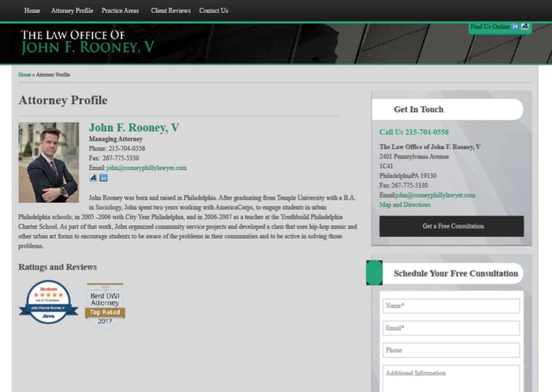
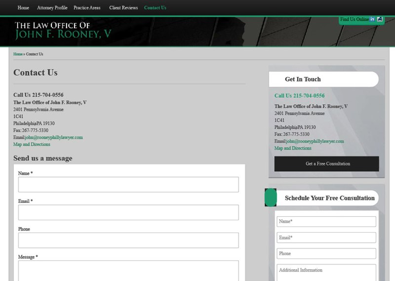
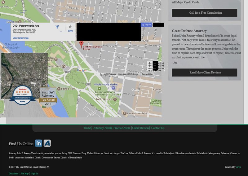
new site
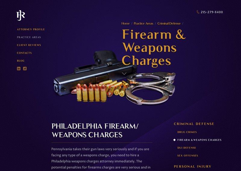
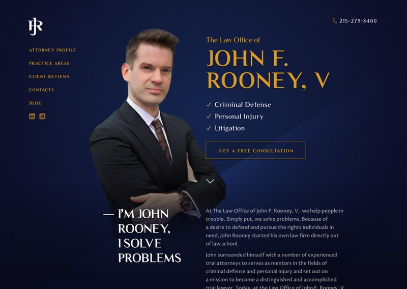
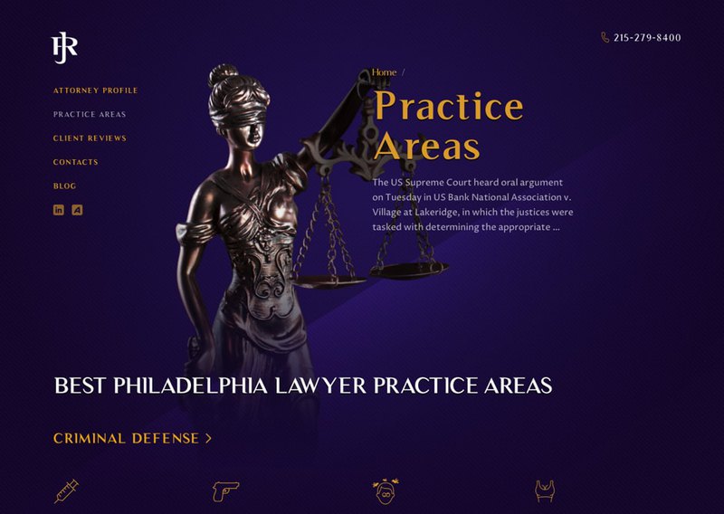
Responsive web design
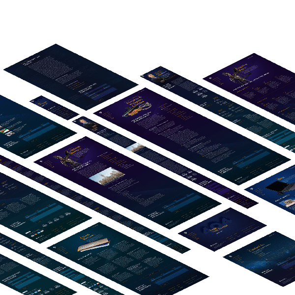
John F. Rooney wanted a website that would be contemporary, fast, and easy to use for his clients and he expected us to find the best solution for this project. We started with the color scheme. We chose deep shades of blue, purple, and green for the background to add a sophisticated look. To shine a spotlight on the important information, we deliberately narrowed down all the excessive elements and rearranged the website structure. Now, the structure of the website allows it to be browsed on any device and browser. Smartphone and tablet users will experience the equal level of loading speed, legibility, and responsiveness as well as PC and laptop users.
Main Page Design
From our experience, we know that making visitors stay on the page for longer is half the battle. We put a picture of John Rooney on the front on the main page as he was a founder of the firm to give a personal touch to the website and make it more engaging, For texts we used a unique font for our client. We didn’t want the site to be plain looking and added some lightly-animated icons to the main page.
As the purpose of the website is to get legal advice and help, all contact information is visible, so visitors can get in touch with the firm’s representatives and get a phone consultation in order to save them time.
To start your business online is a great idea to make it more profitable and we at Direct Line Development know how to create a fast and usable website for your business needs. Our web studio is a team of professional web designers and web developers that has 16 years of experience. Our company have a wide range of services for you to offer such as: website building to direct customers’ attention to your business.
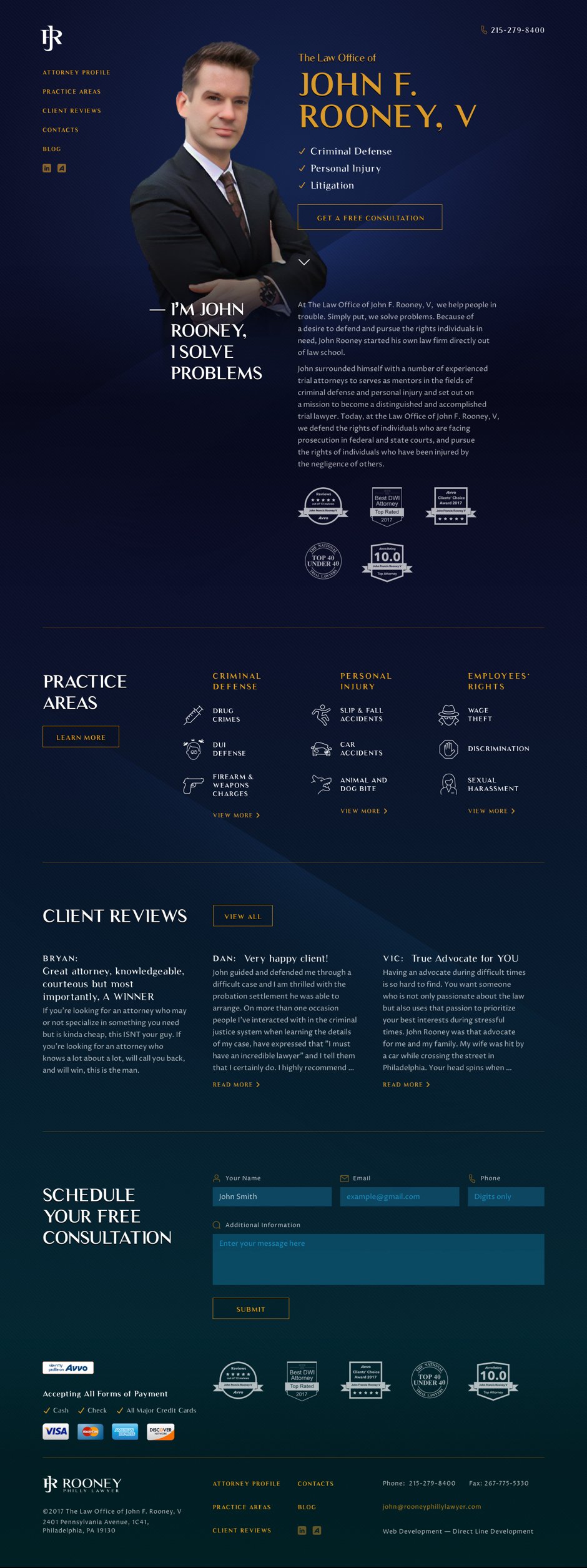
all page design
Advantages
