

Crafting a Marijuana Website Design for Colorado Cannabis Dispensaries
Creating a cannabis website design was a new challenge for our company. Since the cannabis market is still developing, it was an amazing opportunity for us to contribute to the evolution of a fast-growing industry in the US.
High Country Healing is an established chain and the go-to place for marijuana enthusiasts from all over Colorado, but their lack of an online presence was making them uncompetitive in today’s digital world. The client needed a bright, youthful marijuana website design to show off the company’s values and brand identity, as well as let visitors explore products quickly and easily.
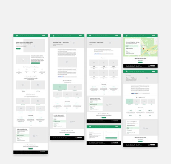
Main Page Design for a Marijuana Dispensary Website
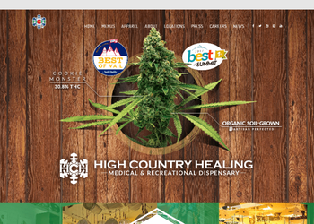
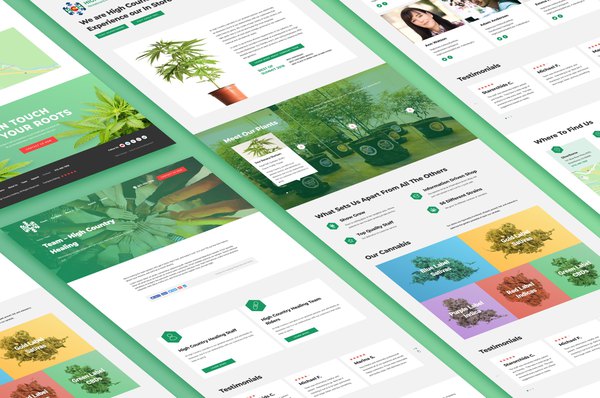
With the goal of creating an overall visual experience that makes visitors say, “I want to buy that right now,” we enhanced the website with a design focused on rich photos of the cannabis plant throughout the site and added parallax effects. Also, users can quickly find the nearest dispensary location thanks to a powerful UX.
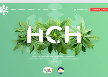
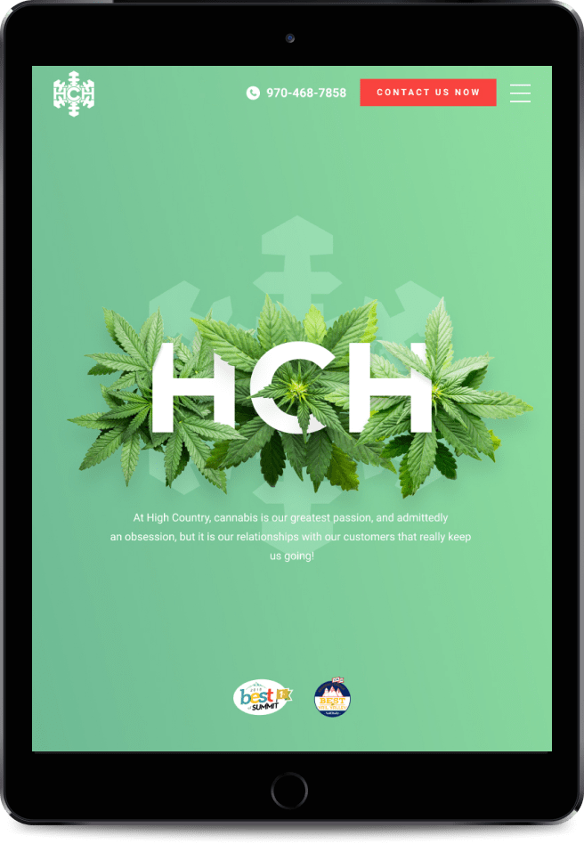
On the main page, there are two primary elements of the brand identity: the logotype “HCH” and cannabis leaves twining the characters to create a dynamic graphic. This marijuana dispensary website now has a sleek, modern design and vibrant color palette that amplifies and draws the focus to the bright, vivid images of the company’s products.

Advantages
Websites to Buy Marijuana Seeds as the Best Example of Responsive Design
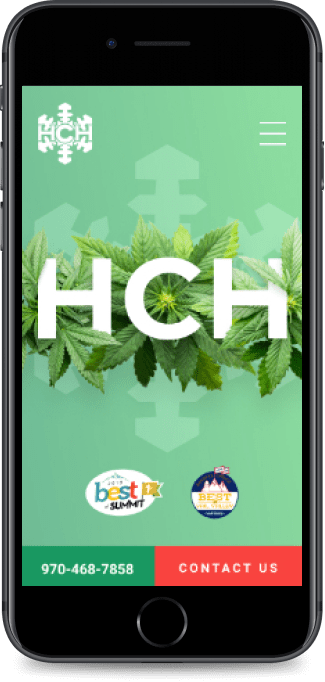
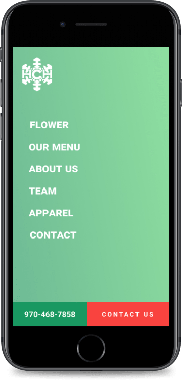
There are virtually no projects for designers that involve only desktop versions these days because, in the last few years, more and more people have switched to using mobile devices to browse and shop online. The increase in mobile device usage makes websites to buy marijuana seeds, edibles, and more the best choice to implement a responsive web design because purchasing decisions may be “impulse buys.”
Congratulations High Country Healing on your website!
Our latest projects
Testimonials
The latest news from our blog

