
Mobile Website Design

Responsive Websites Keep Customers Coming Back and Making Purchases
Our mobile web design company has a team of experienced professionals who keep up-to-date with the latest mobile web development. We have conducted studies where users have interacted with mobile sites in an array of designs. We aim to use the best possible mobile technology and research to ensure we create the best possible mobile websites for our valued customers. With the abundance of competition out there and people constantly on the move, your business cannot afford to lose out on mobile clients.
Responsive websites are essential to keeping your visitors coming back and making purchases. Do you have the latest version of a mobile friendly website? Our mobile website design company will focus on every aspect of your site. Desktop main pages are typically used for messaging, advertising and the overall homepage. However, the mobile design of your main page for mobile devices should focus on directing users to the content they are seeking. Some of the principles of main page design include call to action buttons, attractive menus, and easy navigation. Does your current site take these elements into consideration?
A Mobile Friendly Website Will Be Easy to Navigate
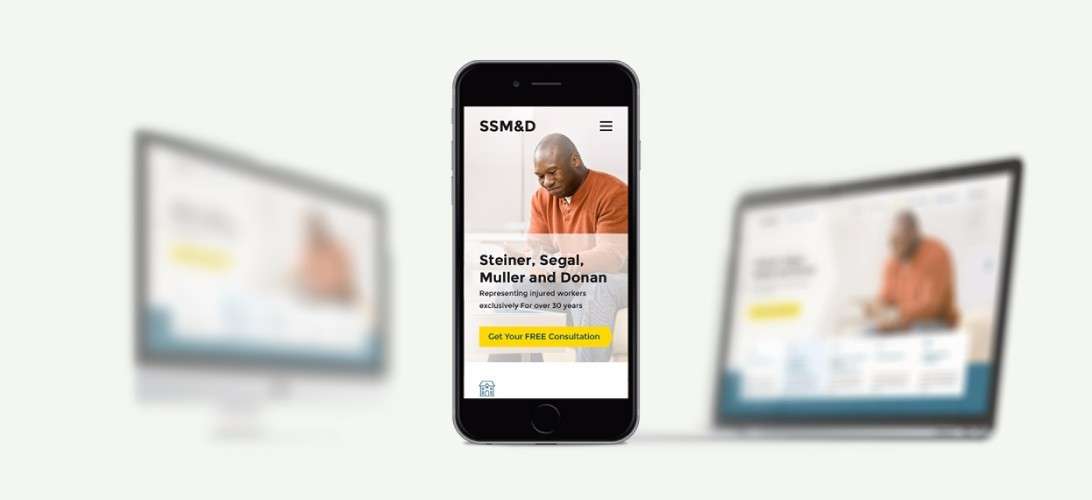
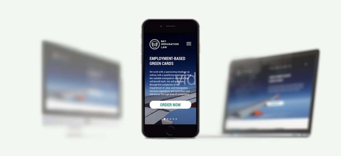
The main page of your mobile friendly website should be responsive and offer users quick and easy navigation. The call to action buttons can help users skip some menu items, so they need to be prominently displayed. Our mobile website design company realizes that the easiest way to make a user perform a task on your mobile site is to have the primary call to action displayed, while the home page becomes secondary. We put ourselves in the user’s place and make sure we find the perfect place for the call to action buttons. Have a look through our portfolio for a few examples.
The benefits of a mobile friendly website include:
- Easy to use
- SEO friendly
- QR codes can be incorporated
- It sets you apart from the competition
- Improve customer relationships
- Your site becomes portable
- Offline integration
- Brand management
- Higher search engine rankings
- Reduced load time
| Device | Portrait (px) | Landscape (px) |
|---|---|---|
| iPhone 6+ | 1080 x 1920 | 1920 x 1080 |
| iPhone 6 | 750 x 1334 | 1334 x 750 |
| iPhone 5 (5, 5S, 5C) | 640 x 1136 | 1136 x 640 |
| iPhone 4 (4, 4S) | 640 x 960 | 960 x 640 |
| iPhone (1st, 2nd & 3rd Generation) | 320 x 480 | 480 x 320 |
| iPad Air / Retina iPad (1st & 2nd Generation / 3rd & 4th) | 1536 x 2048 | 2048 x 1536 |
| iPad Mini (2nd & 3rd Generation) | 1536 x 2048 | 2048 x 1536 |
| iPad (Mini, 1st & 2nd Generation) | 768 x 1024 | 1024 x 768 |
Having a mobile version of website will allow your visitors to get quick and easy information. To make your mobile website design mobile-friendly, we will develop the site with the needs of the users in mind, no matter what your market or content is. Responsive web design is the key to standing head and shoulders above your competitors. These days, just about everyone has one or more mobile devices, which means that queries from mobile devices have increased dramatically, and continue to do so. Your Denver, Philadelphia or Austin business cannot afford to miss out on being mobile!
Call us now


Comments