What is Responsive Website Design and Why Do You Need It?
Skip ahead
You’ve likely heard the term before. “Responsive website design” is the au courant phrase of web development—bandied about in Engineering departments, written about extensively by tech bloggers, and used liberally to seduce potential clients into new business. But what is responsive website design and how does it apply to you?

It’s important to know that over 50% of all Internet searches, like Google, are done on mobile devices, whether smartphone or tablet. Equally important is that over 80% of internet users who search a company on Google will visit the company’s website with the interest or intent to make a purchase. When a company’s website is inadequate, it risks missing out on this large group of buyers. In contrast, a responsive website design prevents this loss, leading instead to substantial revenue gains.
If that claim seems far-fetched, consider this: when you’re surfing the Internet on your phone to see a restaurant’s menu, and the text is so small that you can barely read it, or it’s so big that it becomes stretched and illegible, what do you normally do? In frustration, you probably hit the back button and think less favorably about that business. Your initial impression of that negative website browsing experience sticks with you, because in today’s age, experience is everything.
Instead, many businesses and organizations today are striving to make mobile web browsing a pleasant and rewarding experience for the people visiting their site by using a solution called responsive web design. By using this approach, these companies are rewarded with increased revenue captured from a very large base of people searching their services on a mobile device.
What Does “Responsive Web Design” Mean?
Responsive web design means that a website can legibly fit the screen of any mobile device. All of the text is readable, all of the images are clear, and everything fits the screen as perfectly as on a laptop or desktop computer.
But why is responsive web design important? Because it allows a business to put its best foot forward and give the site visitor a great browsing experience. Whether you realize it or not, site visitors appreciate and now even expect a well-designed online storefront when searching a company on the internet. Because of this, progressive businesses now recognize the importance of responsive web design.
How Does Responsive Web Design Work?
From a technical standpoint, responsive web design is based on percentages. A responsive web design company assigns varying percentages to the proportions and dimensions of elements on the web page, including images, columns, and text boxes, using professional website design tools. Thanks to the percentages they assign to these site elements, the layout of the responsive website automatically makes adjustments and scales everything on the original site to fit a mobile user’s device screen.
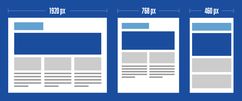
For example, when viewed on a desktop or laptop computer, a website may show three columns of information on a given page. When the viewer is looking at the same page on a mobile device, which typically has less screen space, they may instead see only two columns, allowing them to comfortably and clearly view the content of that page.

There are some very important key responsive web design characteristics which a responsive web design agency adheres to when designing a mobile compatible website. These include:
- A Flexible Grid System: This is an intuitive, responsive Cascading Style Sheets (CSS) grid system with 24 columns that features browser support.
- Flexible Images: These are also referred to as adaptive images. Sizing considerations that would not be necessary for images to appear correctly on a fixed display size become necessary for mobile websites.
- Media Queries: This is a module which allows content to adjust accordingly to screen resolution.
By utilizing these characteristics, a responsive website development company can utilize responsive web design testing to ensure that viewers have the best possible browsing experience.
Responsive Web Design vs. Adaptive Web Design
There is often confusion regarding the differences between responsive web design and adaptive web design. The chart below identifies some key differences:
| Responsive Web Design | Adaptive Web Design |
| Adapts seamlessly to the size of any screen | Uses layouts that are static and unchanging |
| Uses CSS media queries | Multiple layouts developed |
| One site automatically adjusts to screen size | Designed for six screen widths: 320, 480, 760, 960, 1200, 1600 |
To view examples of responsive web design, visit our web design portfolio.
Why Is Responsive Web Design Important?
Many organizations spend considerable numbers each year advertising on Google or other search engines, because increasing the amount of their website traffic often leads to increased sales and revenue. In today’s global economy, you can reach people in more countries than you probably ever thought possible, and they are using all types of devices: smartphones, tablets, laptops, and desktops.

Unfortunately, many sites are still only designed to be viewed on desktop computers, despite the fact that we live in a mobile society, and fewer and fewer people are getting their information from desktops. According to research conducted in 2019 by Statista Business Data Platform, about half of people getting their information online worldwide were on mobile devices. Statista revealed that “mobile devices (excluding tablets) generated 48.91% of global website traffic, consistently hovering around the 50% mark since the beginning of 2017.”
Spending a lot of money for a professional website design that only you and your team can see isn’t going to help drive your business any better than your previous website, and when you consider that the majority of consumers use mobile devices the majority of the time, the advantages of responsive web design are clear. Having a website that is mobile responsive is not only surprisingly affordable, your website visitors and Google will both reward you for it. In 2016, Google notified website owners that they would continue to decrease search results visibility for websites that were not mobile-optimized, because people clicking on those websites were having poor viewing experiences. And since less than 30% of all Internet users go to the second page of search engine results, organizations today must prioritize responsive web design to have a substantial Internet presence.
The Importance of Responsive Web Design for Successful Ecommerce Results
We’ve said it before and we will say it again: it is absolutely necessary to monitor your customers’ behavior and know exactly how they found your product or service. It is equally important to identify market trends so you can capitalize on new business opportunities.
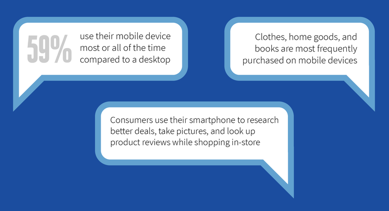
According to a 2019 study publicized by AdColony Research, nearly half of the U.S. population uses their smartphone to make online purchases. Nearly 60% of those surveyed indicated that they shopped most of the time on their device, in lieu of using a desktop computer.

Amazon vs. Barnes and Noble is a great example of this. It has been well documented that visitors to Barnes and Noble have been frequently seen browsing books, seeing something they’re interested in, then going to Amazon and searching for the same book. They compare prices, and if they find it selling for less on Amazon, they buy it there, right on the spot.
Restaurants are another example. Studies show that restaurants with a responsive web design receive 80% more customers than do restaurants with non-responsive sites. Platforms like OpenTable are sending more traffic to responsive sites and getting increasing amounts of reservations because of it.
According to CNBC, total sales this most recent Black Friday exceeded $7.4 billion, with almost 60% of those purchases being made on mobile devices. Online retailers with mobile-friendly websites reaped the majority of these rewards by having the foresight to make their online browsing and purchasing experiences easy. In light of numbers like this, it’s clear that the prices paid for a responsive ecommerce website are easily offset by the revenue gained. The ROI justifies the expenditure.
To monetize consumers’ uses of smartphones for ecommerce, it’s important to understand the ultimate purpose of an ecommerce website. People are constantly on-the-go, and as a result, we tend to want information and experiences quickly. For ecommerce transacted on smartphones, it’s essential that sites load quickly and use functional, responsive web design. Kissmetrics' analytics say that if it takes any longer than three seconds for a website to load, people will click away from it and not return.
Instant gratification is paramount today. Whether fast-food dining or a ten-minute oil change, we want it now. This behavioral characteristic is what accounts for the continuing climb of ecommerce numbers year over year, and responsive web design means more of the pie for companies with up-to-date websites.
What Are the Best Responsive Web Design Testing Tools?
It’s possible that your website can become a mobile compatible website, even if it wasn’t initially designed to automatically adjust to fit a widely diverse array of screen sizes. There are a number of responsive web design testing tools available for you to investigate the mobile-friendly status of your site.
One is Google’s “Mobile-Friendly Test.” Simply enter your website’s URL into the box, and Google will analyze your site to see how it loads on a mobile device. It will even show you how your homepage looks on a smartphone.
Another excellent mobile-friendly checker is PageSpeed Insights by Google. On this page, you’ll again enter your site’s URL, and Google will analyze its content, such as text and graphics, and check the speed at which your page loads onto a mobile device. It will then give you suggestions on what adjustments you can make to speed up your site’s load time. Ultimately, the load time speed of your site can have a big effect on your site’s rankings in the Google search results.
Finally, if you want to know whether your site is mobile-friendly or not, Google Search Console is a must-have in your redesign strategy. It gives you information on how to improve your SEO and which errors and issues need to be fixed.
We’ve Been Providing Responsive Web Design Services for 20 Years
Companies that don’t use a responsive web design are not only invisible to the people searching for their products and services on the Internet, they are losing out on very substantial amounts of revenue. The “Internet of Things” is changing quickly, and businesses need to be using the most current technology to remain competitive.
Direct Line Development offers comprehensive responsive web design services that can make all the difference between a thriving online presence and relative obscurity. At our Philadelphia, Denver, and Austin studios, our designers intimately understand the need for mobile compatible website design and create new sites accordingly. Our goal is to provide you with the latest in website technology, greater user satisfaction, and increased profitability.
If you have questions or would like a quote on a new website, please contact us today. We’d love to talk with you to learn about your current needs and explore how we can add value to your business.
Want a Modern & Functional Website? Here It Is!


Comments
Responsive Design is here to stay!!! If your website is not responsive at this point, you are missing the boat... People are glued to their phones and the expectation is Good User Experience. They want information on the go and they want it now. It is extremely important for your website to open up quick on any Device as well as to adjust to the different screens without loosing the integrity of your website in this process as explained in this article.
Time and time again we explain to our clients the importance of this not only for people visiting their sites, but for Google Rankings due to their Algorithms promoting Mobile First. This being said, Not Responsive simply means You are giving up and just handing your competitors the key for them to rank higher and get more visitors into their site.
Funny thing, I was speaking with a Google representative just the other day and I asked what she knew are the most important trends in website development that affect search rankings. Very quickly she said "mobile speed and mobile responsiveness", now I know this is just an anecdote but nonetheless but with stats like having 60% of the previous Black Friday sales being made through smartphones, this is clearly a permanent trend.
Very important topic that is here to stay. No longer enough to just have a website fit for desktops. Consumers research all products and services on their cellphones and will quickly leave your site if they cannot quickly understand what they are viewing.
I know some people that exclusively use their phone for all internet browsing. Having your site look great on mobile is more critical than ever and is a must for every business!
Purchasing something online using a smartphone saves a lot of time and keeps a customer happy, so it's a crucial component for businesses nowadays. However, some people are concerned about smartphone security and stay away from using them when paying online
In our day and age, responsive websites are a must. Especially when you take into consideration with all of the new phones coming out. Mobile devices are only expanding and growing, people rather search something on the fly then going on the computer. Great read!!