
12 interesting and attractive website design ideas
Skip ahead
- Personal Website Design Ideas: Interactive Game on the Main Page
- Geocontent as a Web Design Content Idea for Your Website
- Video Background in Website Design for Bay Immigration Law and Direct Line
- Video inside letters on the website of Media Active
- Buttons change colors as part of the web design for Plasticofficesigns
- Performance Electrical Contractors website & animation of the background
- Terrific animation for the website design of AOR ITS
- The Funny animated sun moving its eyes on Bambo Jambo’s Website Design
- Animation for the website design of Captain Steamer
- Super-duper layout and responsive web design for the Evolt project
- An interactive, website design idea for Global Conservation
- Awesome web design for the Junction Ventures site
- Responsive website for Robert Maher
- Hover effects in the design of the Mel's Pizza Eatery website
Any person who is planning to create a new site needs website design ideas to make the project more attractive and comfortable for the users. Sometimes it’s hard to find a worthy graphics solution, good images, and creative animation. Sometimes there is no inspiration because inspiration doesn't have a schedule. That’s why it’s so important to learn from other IT companies and design studios in order to draw abstract concepts.
Direct Line Development wants to share its design experience and presents 12 interesting and attractive website design ideas applied in real projects in Philadelphia and Denver.
Personal Website Design Ideas: Interactive Game on the Main Page
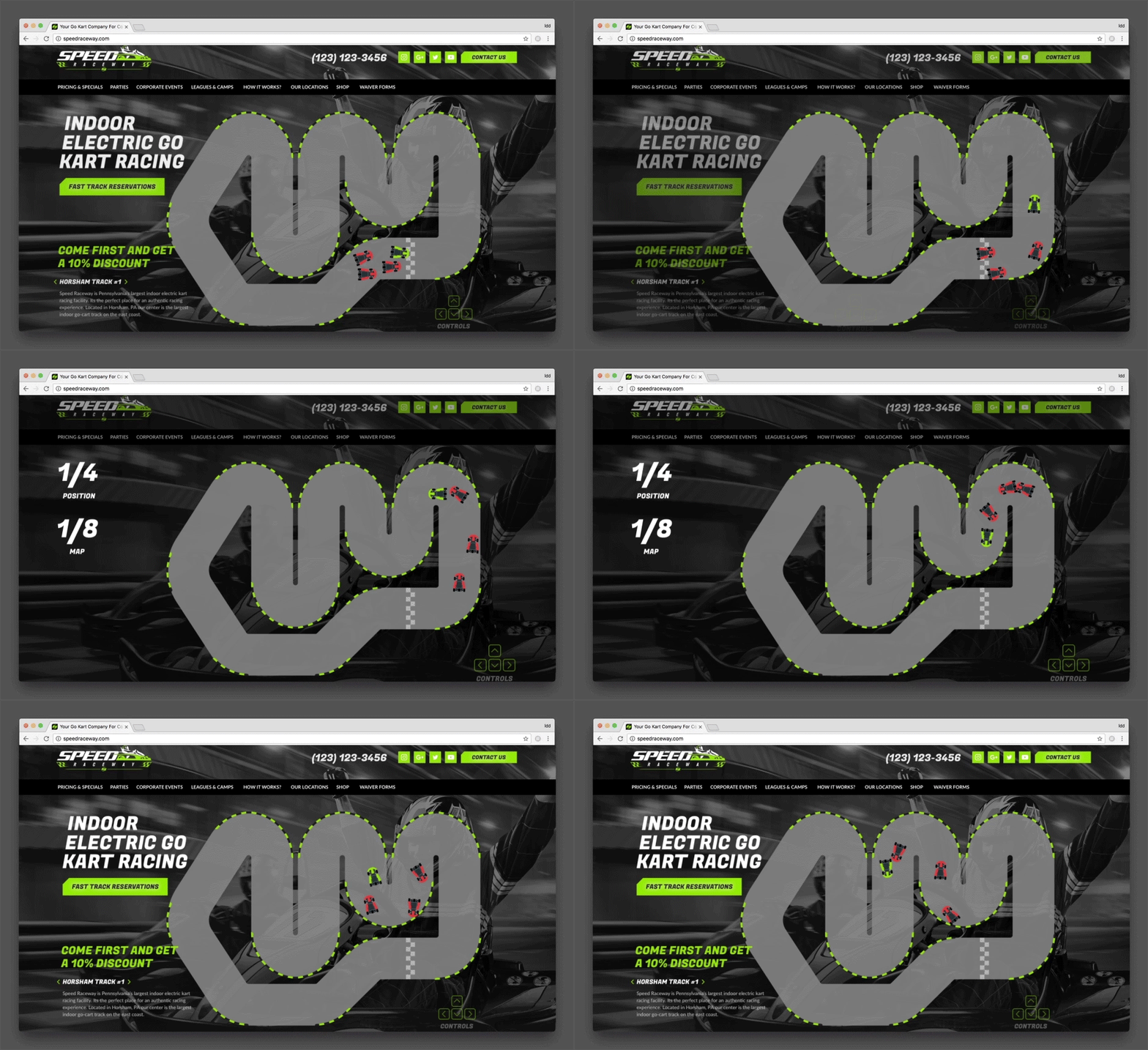
So many web pages lack creativity and end up being uninteresting and forgettable. You will mostly find sales and discounts information on such web pages. In order to engage your users, you need to come up with innovative, modern and personal website design ideas to keep your visitors coming back to your site. This is why it's crucial to follow four simple rules to make a truly effective website. Our idea is to revitalize a page with a simple, innovative and interesting new game. In order to engage a user, a game has a prize in a form of a discount for successfully completing the game. And if a user wants to receive a prize, they need to leave their contact information, which means that you will have an opportunity to send professional marketing emails in the future.
Geocontent as a Web Design Content Idea for Your Website
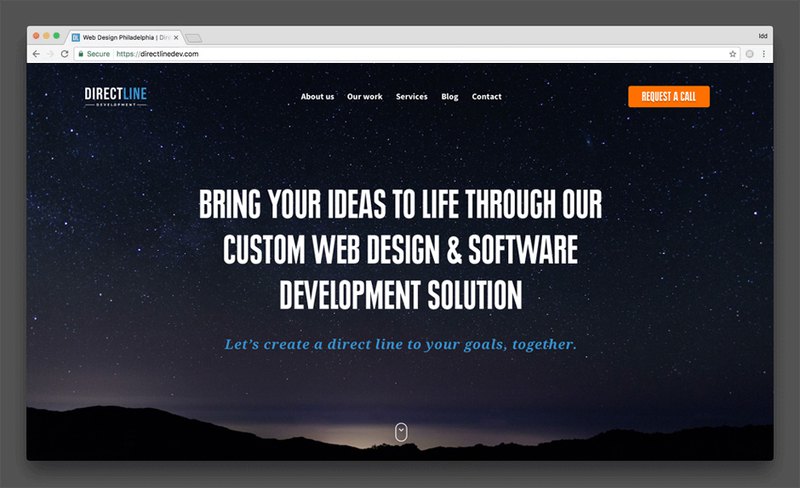
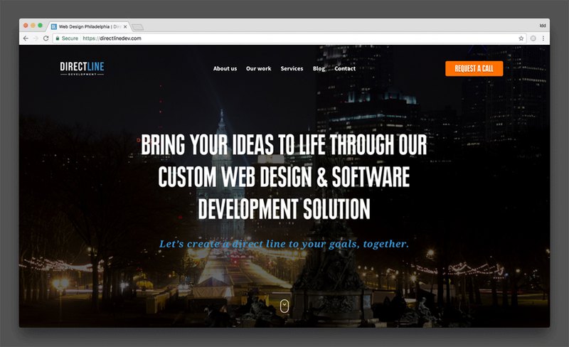
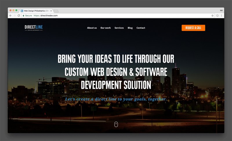
Currently, our Direct Line Development company has offices in Philadelphia and Denver and we were strategizing about how to show localized content to users from other cities. This is not a difficult task for developers when your team has the inspiration to impress. We ended up with a time-lapse of Philadelphia city at night that users in Philly see and residents of Denver would see a similar video of Denver at night. And if you open a website from any other US location, you will see a night sky on the homepage.
This idea makes your website appear more local and modern to your users. You can take this idea and use it throughout the whole business website. For instance, when you take a look at our services page, we have a separate block that offers a user to contact our sales team. That block will show a Denver salesperson if you are in Denver and Philadelphia one if you are in Philly.
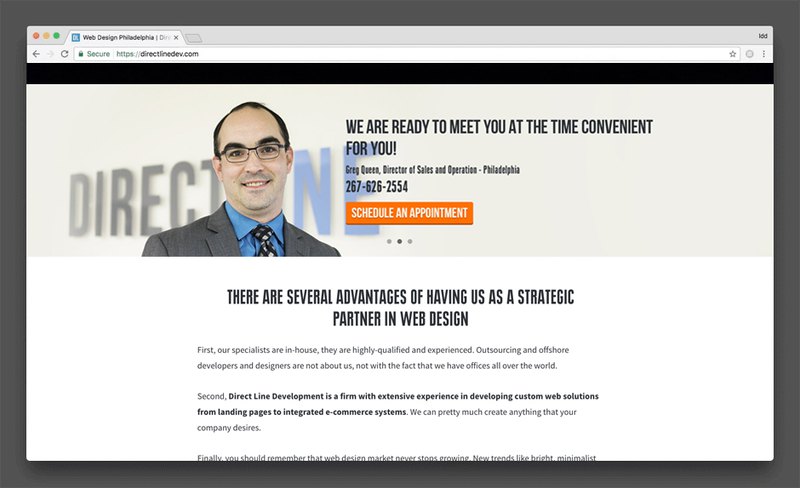
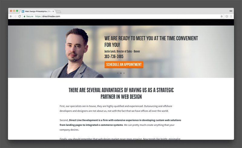
It’s a great idea for anyone who has multiple representatives in various cities.
Video Background in Website Design for Bay Immigration Law and Direct Line
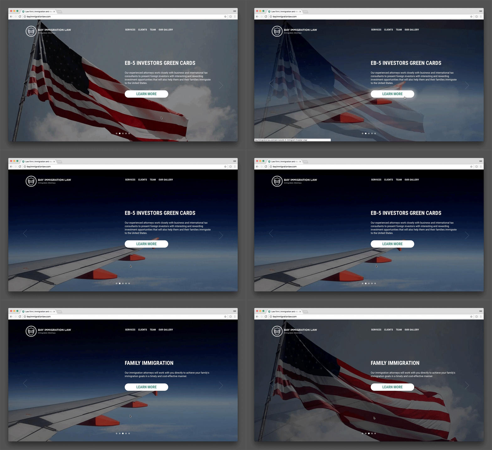
We have implemented a custom video background to Bay Immigration Law and Directline website designs to draw the attention of the users. The flying American flag and a wing of the plane as metaphors for the main activities of the company are the right ideas to represent the business.
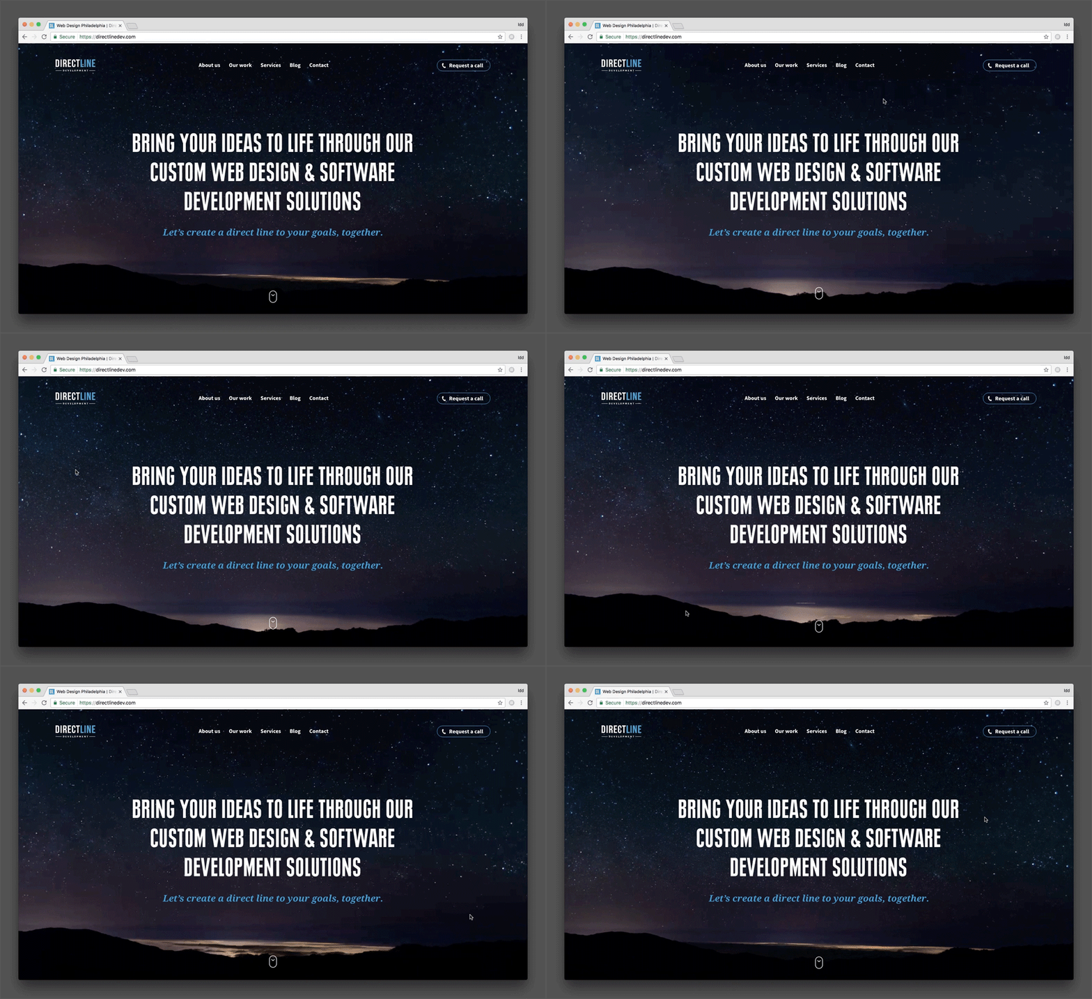
Our designer also added Parallax to Direct Line Development’s site - a beautiful night starry sky.
Video inside letters on the website of Media Active
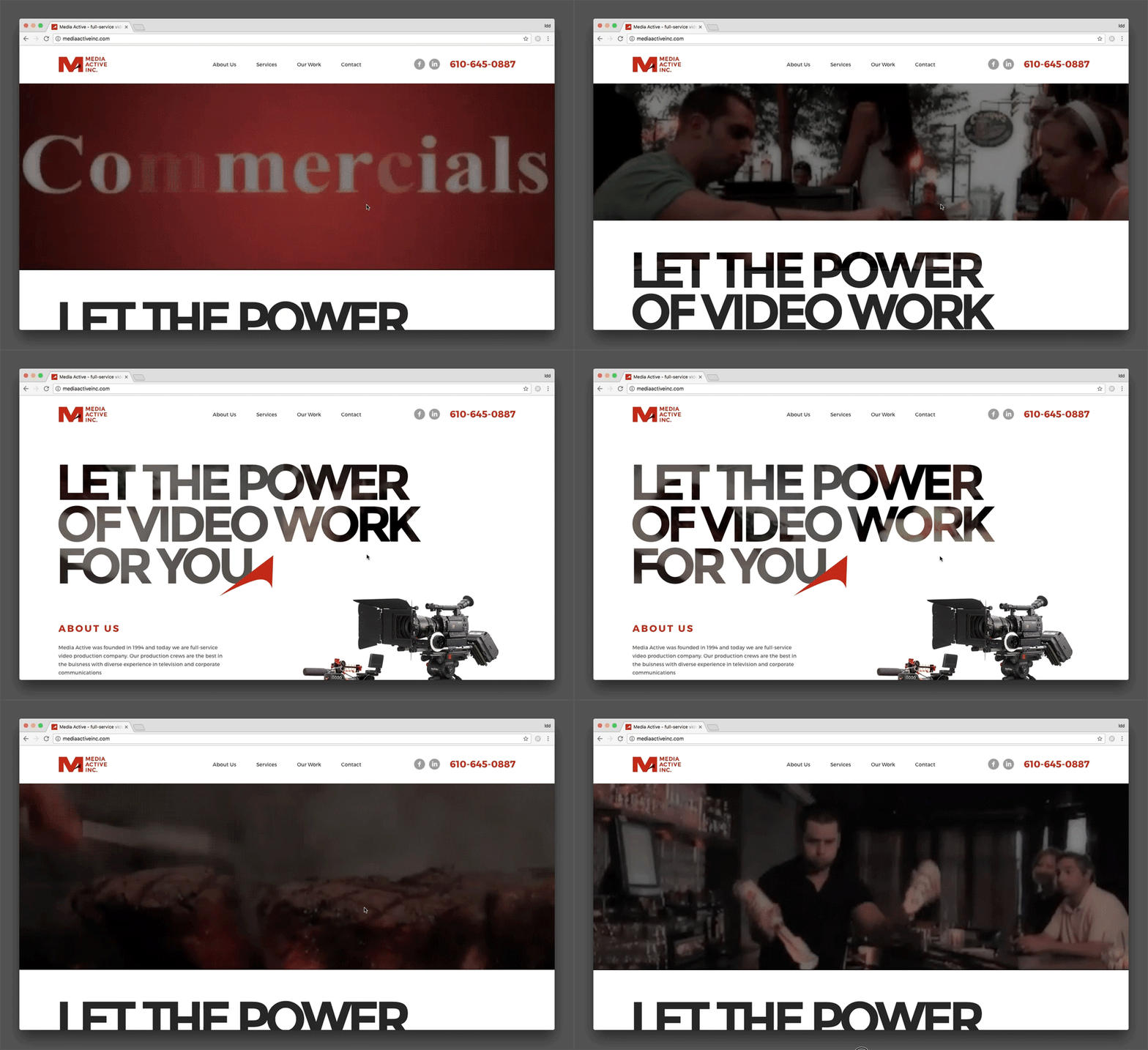
Media Active Website can be interesting for those designers who value fresh ideas. For example, several videos appearing behind the huge letters. These videos reflect the activities of the company. The animation is stylish, unusual and let any business stand out of the crowd.
Buttons change colors as part of the web design for Plasticofficesigns
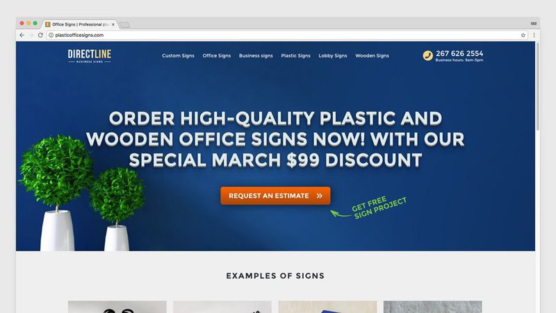
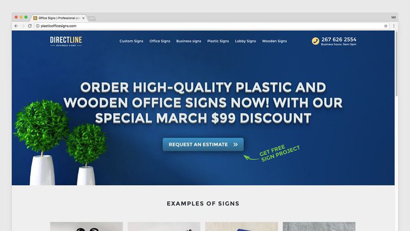
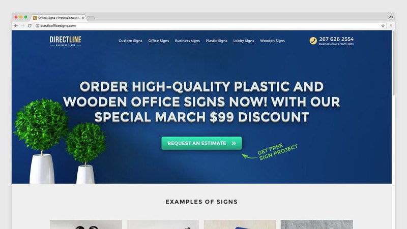
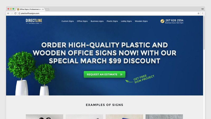
Plasticofficesigns has a unique web design created by our professionals. The buttons are changing their colors while reloading the page. It is considered that it is possible to find out what color of the button is more preferable for a client. For example, people do not click on green, orange and red buttons.
Performance Electrical Contractors website & animation of the background
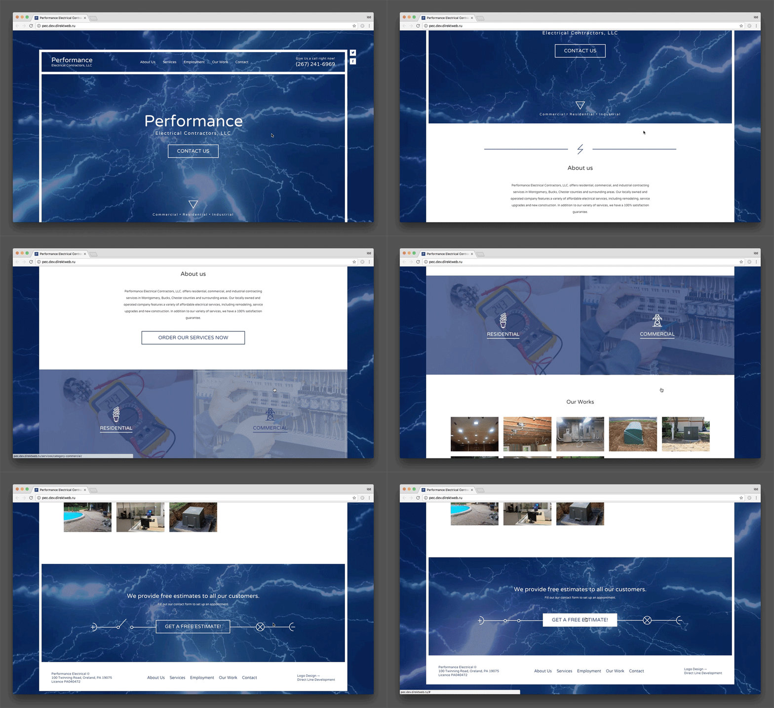
Performance Electrical Contractors LLC has an animated custom website design, namely its background. There is continuous lightning strikes which creates an atmosphere of an electrical network in the background of the home page. This element does not depend on the scroll of the entire site. This is definitely the right solution for this kind of business.
Terrific animation for the website design of AOR ITS
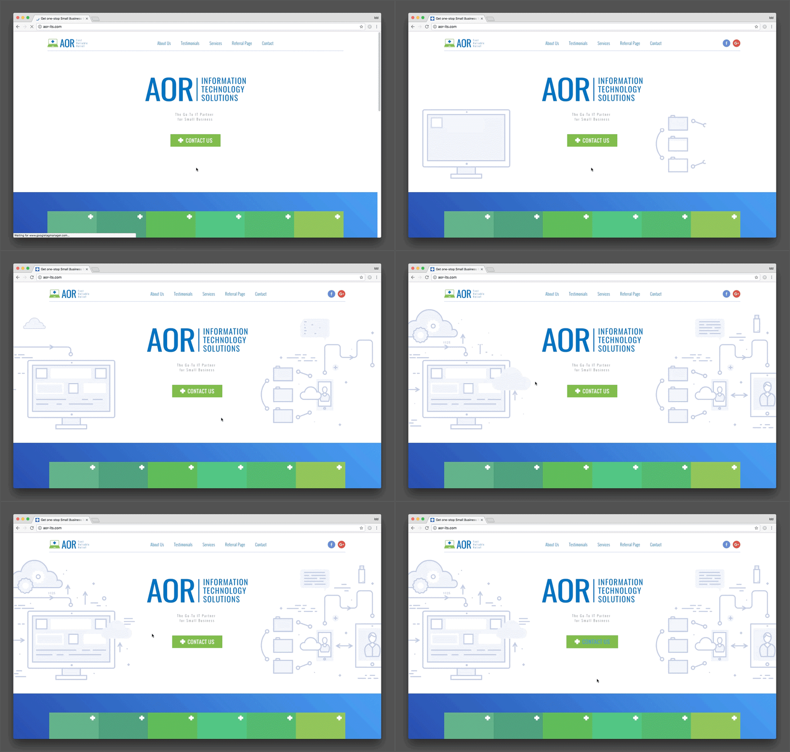
When you open the website AOR Information Technology Solutions you see an interesting animation scheme of the company’s professional activities. The image loads on the screen like a picture being drawn by a painter. When the animation finishes, the graphic becomes static.
The Funny animated sun moving its eyes on Bambo Jambo’s Website Design
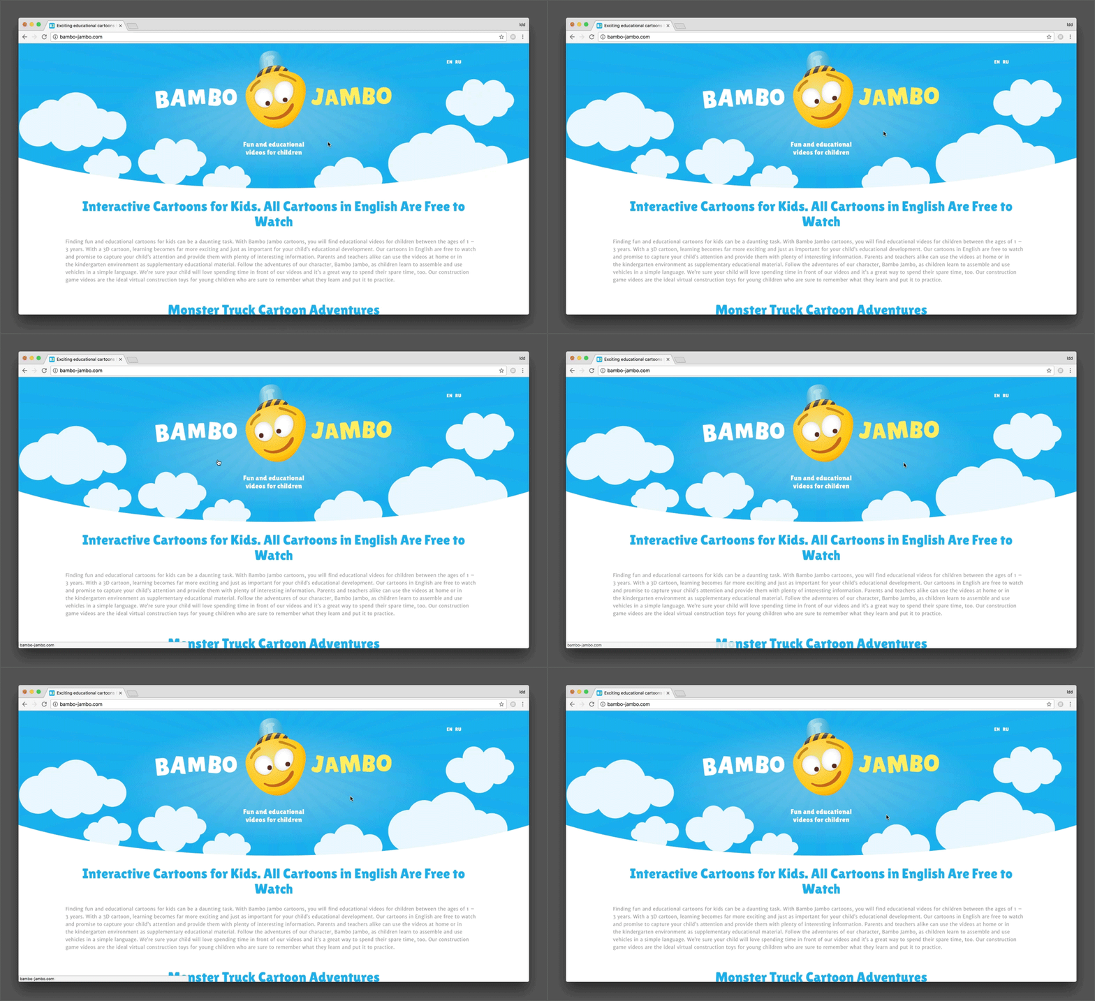
One of our best website design ideas for Bambo Jambo. It is a website that consists of interactive cartoons for children. When you open the home page you can see an animated sun above the main text. The character’s eyes follow the mouse cursor when you move it around the website.
Animation for the website design of Captain Steamer
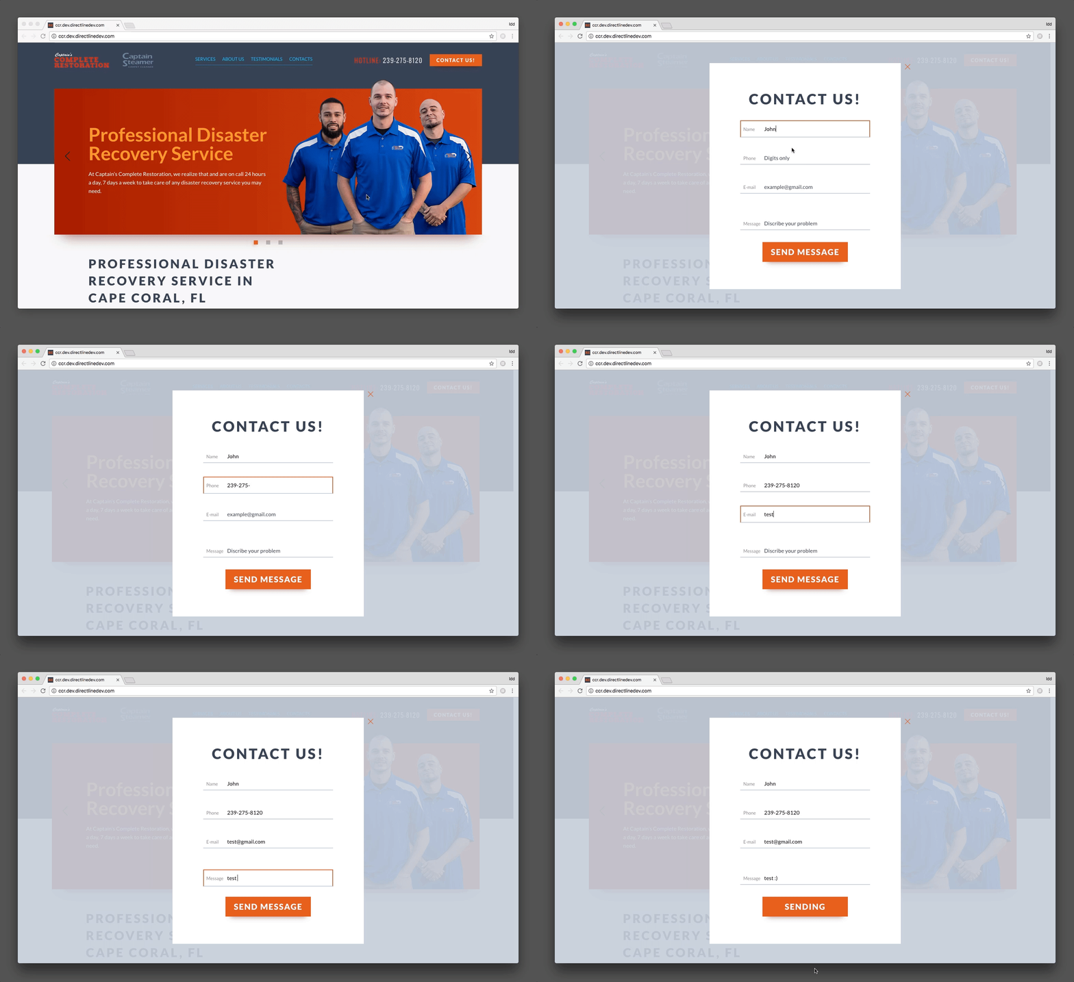
One of our custom solutions is a creative design for Captain Steamer. The animation on the homepage is rather fascinating. It attracts the attention of your eye and helps users with filling in the fields of the form on the website. Such a hint is a good idea for the site.
Super-duper layout and responsive web design for the Evolt project
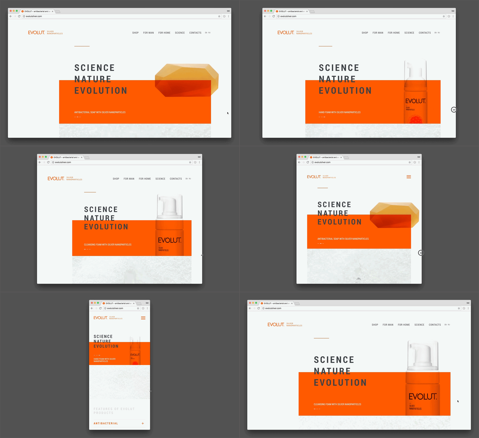
The peculiarity of the website design for the Evolt company is its perfect layout and frontend development. The site looks great on any device and screen-size. You can change the resize the browser window, and the content will adapt to the different resolutions! Responsive web design is a great solution for any business website.
An interactive, website design idea for Global Conservation
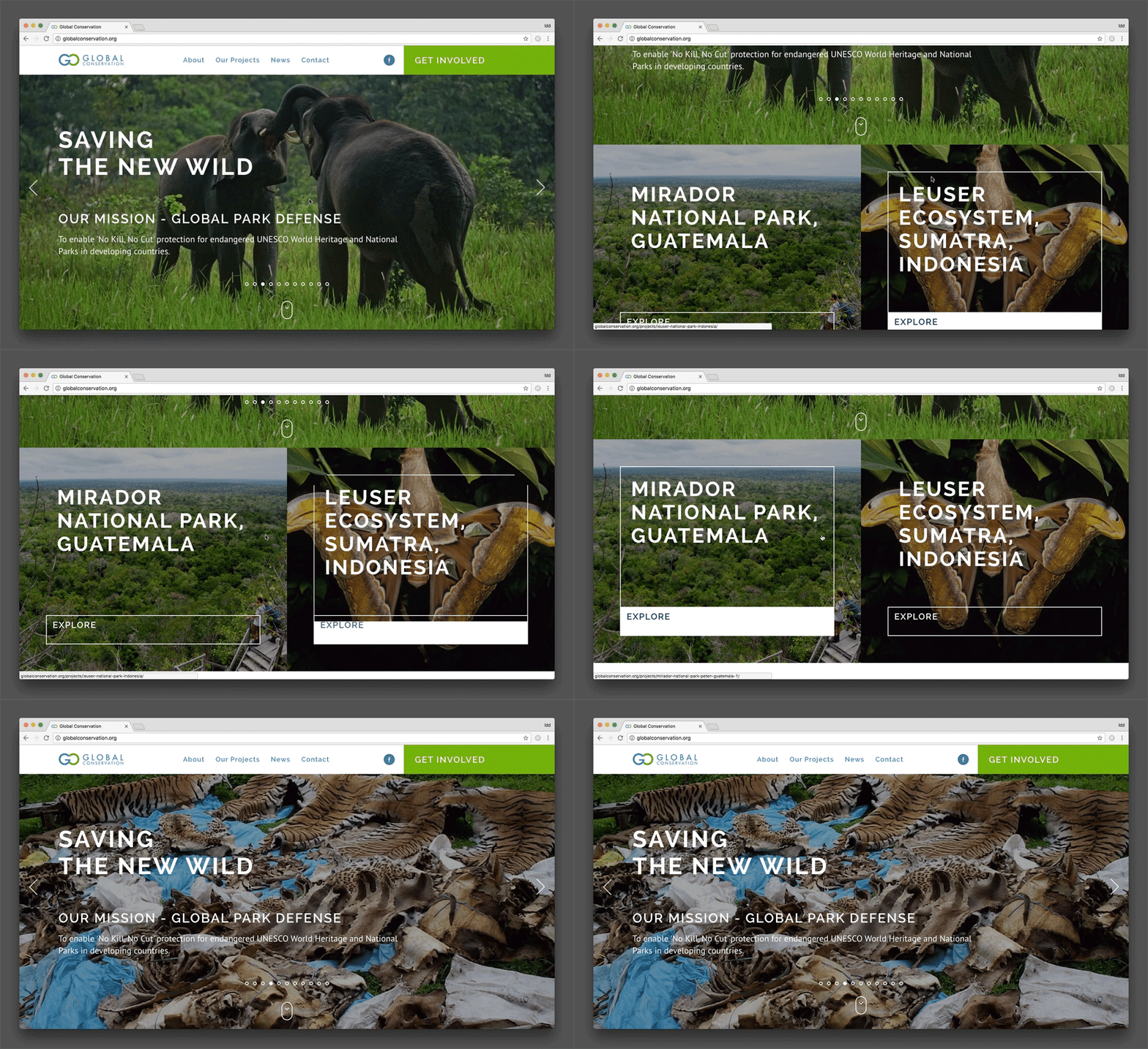
The website design for the project Global Conservation is characterized by a white frame appearing around the news as you are pointing at it with your mouse. This custom interactive element of the interface makes a user pay attention to this particular blog article.
Awesome web design for the Junction Ventures site
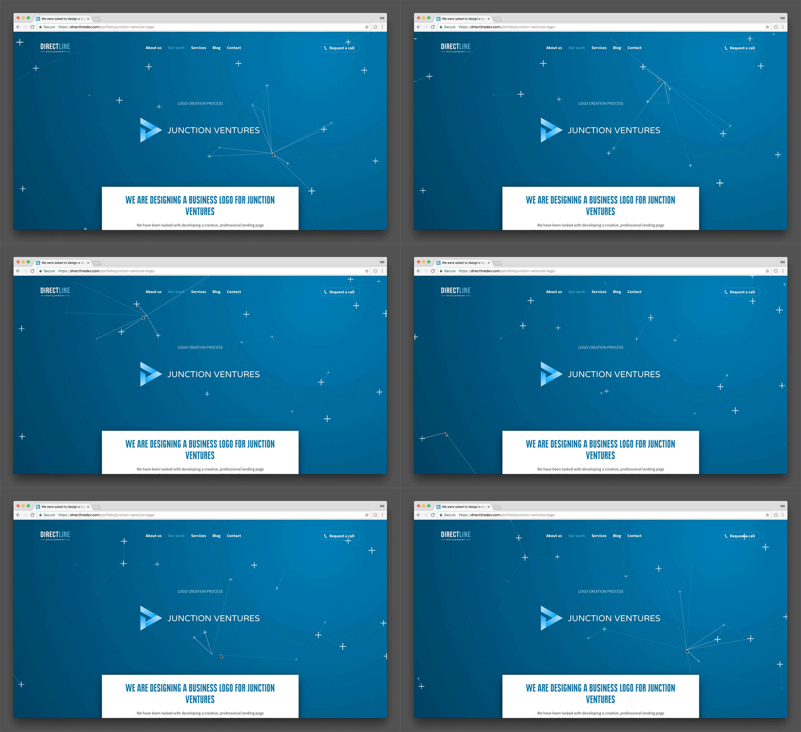
The background of professional site for Junction Ventures is decorated with lines which appear when you mouse around on the home page. It was coded by our developers, and looks awesome as well as being interactive. We can admit that this web design is great!
Responsive website for Robert Maher
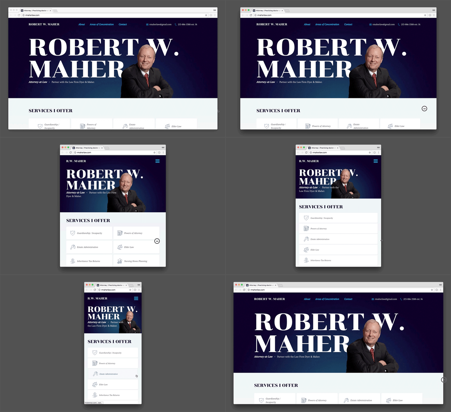
The upper image located on the main page of Robert Maher website is responsive. When you change the screen size some sentences of the text appear to be behind the image and others show up in front of the picture.
Hover effects in the design of the Mel's Pizza Eatery website
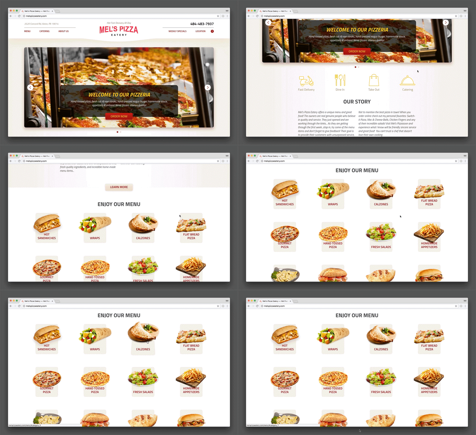
The website of the pizzeria Mel's Pizza Eatery has a very beautiful and tasty looking design. But the most interesting part is its menu. It‘s divided into categories each of which has a picture with a dish. When you hover the mouse over the picture it begins to move toward you.
The article was updated on June 26, 2018.
Comments
The ideas listed in this article are only a few of many that our talented Designers and Developers executed. We are extremely lucky to have a large team that can collaborate on projects and come up with the best solution for our clients.
There are so many components to keep in mind when building a website and putting it all together it is truly an art form.
Having the ability to do Custom Sites gives our team a lot of freedom in coming up with concepts and every detail of the design, not having to have ideas fit into a mold. When compared to Template based websites it makes a huge difference in the final product and our clients end up with a one of a kind website that we are proud to add to our portfolio.
It is extremely important to keep in mind that clients are not just hiring us to build pretty websites, every website should be build with a goal in mind.
Simply stated: What do we want our visitors to do when they come in to our website?
And this requires a whole new set of skills from Designers and Developers!!!
With the world of web design being dominated by templates that are essentially the same, it's more important now than ever to stand out with these custom design features. I'm a big fan of interactive backgrounds, maybe because of my attention span but that's what keeps me on a page longer. If Google can get you to stay on a disconnected internet screen because of a game, then a little bit of interactivity will go a long way on any website.
Great ideas here! Anything you can do to engage the visitor and capture their attention is key. The days of static pages are gone because they no longer stand out. Separating your business from competitors is key and these are some of the best ways to do this.
I love the way we stay ahead of the trends, and when you flip through our portfolio, you can really see how we like to customize each design and tailor it to the needs of each client.
These are some very cool ideas which can help any website to stand out! When you have a business you want your website to be different from your competitor's websites and implementing an interesting design element or a unique interactive feature would definitely help.