Skip ahead
- Your Website Must Be Responsive
- Use Pop-Up Chats
- Use Remarketing
- Take a Personal Approach With Your Website
- Remove All External Links
- Use Google Analytics to Identify and Correct Weaknesses in Your Website
- Divide Texts With Sub Headings
- Make Sure Your Contact Information Is Easy To Find
- Divide Information Forms Into Multiple Stages
- Use Checkboxes Instead of Just Lists
- Summing It Up
Websites are incredibly valuable assets to any business. They work for you day and night, 24 hours a day, 7 days a week. But how can you be sure that you are getting the most out of your website? Unless you are a trained programmer or designer, chances are slim that you’re doing everything possible to increase the amount of business your website generates. If you’ve made it this far, you’re well on your way to becoming an expert on increasing customer conversion to your website. If you haven’t read the first two articles, we highly recommend you do so first before proceeding. Keep in mind that all of the following examples are from real work with our current clients. Without further ado, we continue our series below.
21. Your Website Must Be Responsive
In today’s world and the “internet of things,” more than 50% of all online browsing comes from mobile devices. The amount of site visits from iPads, TVs, cars, etc., is only going to increase every day. It is no longer a question as to whether or not your site needs to have mobile capabilities. Responsiveness not only makes it easier to see your website, it makes it easier to find your website. As of April 2015, Google implemented an all-encompassing requirement for the website to have responsive capabilities in order to be highly promoted in their search engine result rankings. Let us say that in a different way: if your website is not responsive, Google will lower its rank and reduce your visibility. If you don’t have a responsive site, the number of ones that do will easily push you into the background. If your site is not adaptive, you are missing out on literally half of your potential customers, and that figure is only going to continue to grow.

22. Use Pop-Up Chats
Sometimes it is helpful to answer your customers’ questions right away, showing your knowledge and accessibility. It also fits the general theme of web design and development: cater to the impatience of users. Sometimes customers will be so impatient that they won’t even bother looking through your various internal pages no matter how well-structured your site is. This option also works well with older generations who may not be as confident as younger users in browsing the internet to find what they need. By providing a popup chat window to speak with directly, you are relieving them of a prolonged scavenger hunt and adding a personal touch to their internet experience, something they likely were not expecting. It is true that these chats can be annoying to some, but they wouldn’t exist if people weren’t using them. It’s best to use them in the most unobtrusive form as possible. Just like popup ads, the more annoying something is to users, the more clicks it gets. Some would consider anything on a website that gets a user’s attention a successful tactic. Others would disagree. For us, it all depends on the tactfulness with which the attention-grabbing technique is employed. From our experience, when a popup window is well-designed and well-implemented, they only serve as an effective boost to overall customer conversion rates.
23. Use Remarketing
We’ve all been there: we go to the website, read the information, begin to make the moves toward checkout, and then decide last minute that we will buy later instead. To the unwitting business owner, this seems like an opportunity come and lost. Thanks to technology, however, this is no longer the case. With the proper team helping you, you can display ads to this person while they browse the internet. This may sound invasive, but it has likely been used on you without you giving it a second thought. Think about a time whenever you may have been looking online for a pair of shoes or a new phone. You probably browsed a few sites, compared prices, and left with your mental notes to think the decision over. It is likely that for the next few days or so afterwards, the ads on the sides of the web pages you visited consisted on different shoe sales or phone releases. This is a perfect example of remarketing. We recommend that you use targeted remarketing on individuals for no longer than a week after they visited your site. This type of advertising is very cheap and is one of the most effective methods of customer conversion out there today!
24. Take a Personal Approach With Your Website
Imagine the look on your customers’ faces when they visit your website around the holidays to find that your logo has Christmas lights wrapping around it as a fireplace crackles in the background. Now imagine what your website could look on the Fourth of July, President’s day, Hanukkah? With a skilled development team, you can constantly personalize your website for your audience. In addition of to holidays, you can have your website display information based on whether or not the user is accessing it from an iPhone or an Android, if it is day or night, from New York or California, and the list just goes on and on. The point here is to personalize a seemingly impersonal world. We always tell our clients that their websites are direct reflections of them and their businesses. You not only want to capture the image of your business, but you want to capture its character as well. This is especially important for larger companies who have a hard time, in general, presenting themselves at a personal level to their customers, especially with the stigma against corporate America that many people harbor. By incorporating a personal touch into your company’s still professional website, you are differentiating yourself from the “buy and hold” website owners who launch their website and don’t like another look at it for another five years. There are limitless capabilities for your website, you just need to work with the right people who have the right ideas.
25. Remove All External Links
We all have our sites like Wikipedia or The Wall Street Journal that we love to refer to, but it is important to remember that if you have a link, chances are users will click it. Once they leave, it’s no longer in your control if they come back. It’s best that you do away with this possibility simply be removing all external links. The only links you should be referring to on your website are partners’ websites or links to other pages of your own website. However, referring customers to another business that you own is entirely fine, since they still remain in your market. Facebook was able to circumvent such problems by integrating internet browsing into the social media site, making it seem like you are viewing a new website on its own, but in fact, you are still viewing it within Facebook. You, however, are not Facebook and should leave such undertakings to the conglomerate tech companies.

26. Use Google Analytics to Identify and Correct Weaknesses in Your Website
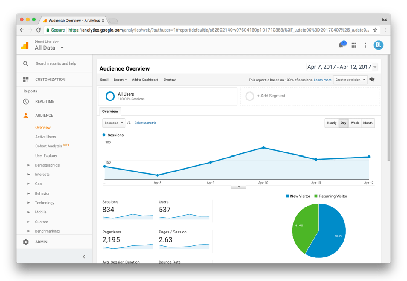
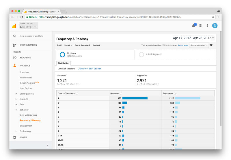
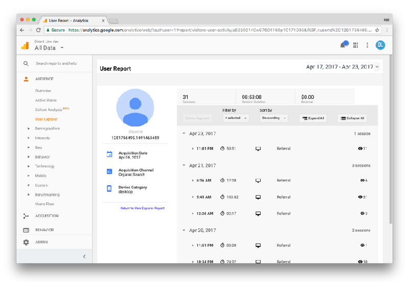
Check which mobile devices, browsers, countries, cities, etc., have high bounce rates and test your site accordingly. It could be that your site has loading errors due to the latest Android update, or that the Internet Explorer version is inaccessible on an iPad. This is something that you can easily do on your own and it can help you reduce costs. For example, let’s say a customer comes to you with a complaint about your website not working on his laptop. At first, this may seem like an issue that is entirely out of your hands, for the number of possible causes for this error are in the hundreds. However, after a bit of personal research on your site through Google Analytics, you realize that your website does not run on the latest version of Windows Edge. Now instead of asking your developer to “find the problem” and racking up costs, you can ask your developer to fix a specific problem, a request with a significantly lower price tag.
27. Divide Texts With Sub Headings
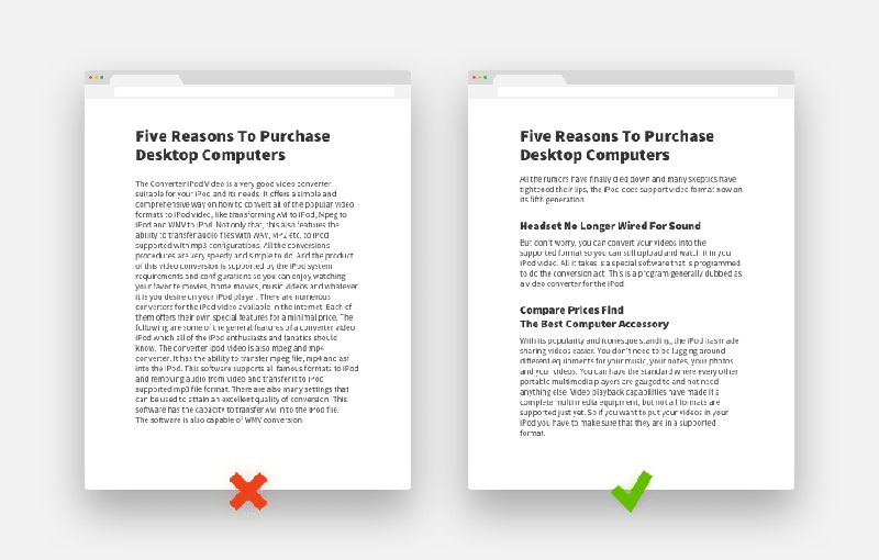
No one likes to sit down and read a plain wall of text. People would much rather be able to browse the headlines in order to determine if it is worth their time reading what’s underneath them. Additionally, by breaking your information down into semantic blocks, you give your site and business an organized and structured perception.
28. Make Sure Your Contact Information Is Easy To Find
Your address, telephone number, and the ability to contact you by email should all be readily available in a prominent place on your website. What is the point of putting in so much extra effort to make your website attractive, informative, and easy to navigate if, after you’ve convinced a customer to buy from you, they can’t figure out how? Nothing is frustrating more for them, plus you’ve only got a limited amount of time before that customer decides to change their mind. It’s great to incorporate all of these techniques to boost your website conversion, but you cannot skimp out on essential conversion factors such as contact information. We cannot stress enough how important this item is.
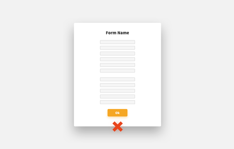
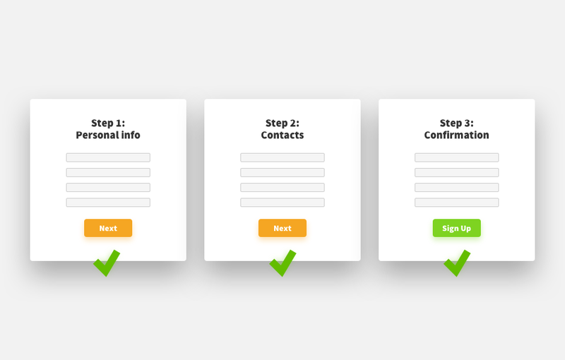
29. Divide Information Forms Into Multiple Stages
Sometimes it is simply impossible to get rid of the “fill in” forms on your website. The shorter and less time-consuming they seem, the more likely it will be that your customers complete them. It would also be useful to replace these forms with options such as “Sign up with Facebook.” Today’s users are comfortable with linking their profiles from different accounts if the website or application seems reputable. This saves them time and provides you with even more information on your customer base.
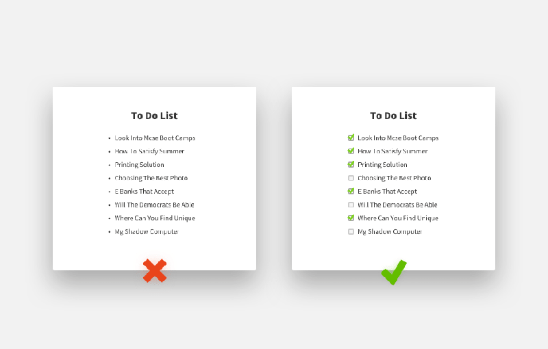
30. Use Checkboxes Instead of Just Lists
It’s just human nature. We love to check things off and we love the feeling of satisfaction that it gives us. By incorporating checkboxes into your website, you are including a piece of User Experience that makes the client feel good and encourages them to interact with your website. You can even integrate checkboxes into your photo galleries.
Summing It Up
All the information we’ve offered you comes from what we do in our day-to-day work. We are constantly discovering and trying new practices to develop and create the best custom websites. Contact us today and we will give you a free analysis of your website!


Comments
Re-marketing is both invasive but an effective way of capturing a customer's attention a second time. Every business owner should employ that technique for their business's overall digital strategy.
The section about "removing links that lead outside of the site" because we all do it. We fall into the Google hole of reading or interacting with something interesting, then we see a link continuing that train of thought and before you know it it's 1:00am and you're on Live Leak watching videos about 12 tangents off of your subject. That's lost business.
Organized and structured perception of your website is key to inform and present your information to a viewer. Well structured blocks can always catch the attention and achieve highest information visibility.