Skip ahead
We all make mistakes when doing our work and there are different causes for it. Some hurry and didn’t notice that they dropped a bollock, the others are not experienced enough to get the work done properly. If speaking of logo design, logo design mistakes can play a crucial role in lacking of new customers. Wrong font and poor color selection, a complex design, etc are the most common logo design mistakes among amateur designers. Delivering a high-quality logo is not the easiest mission to accomplish for even big players in the design industry. It takes a lot of intellectual work, experience, and skills to create a logo that will represent company’s image best.
What are the common logo design mistakes?
You can break logo design from the very beginning by wrong font and color section. The font you choose can be inadaptive to displaying on different carriers and can be hard to read as well. Meanwhile, using too many colors or unmatching colors can hamper perception. Take a brief look at the criteria for logo design:
- it should be unique
- it should be perceived quickly
- it should be adaptive to different carriers
- it should be readable and understandable
- it should be simple in design
- it should be long-playing
Designers can borrow design or use cliches, use wrong software and, as the result, you receive the logo that looks ordinary and dull. In this article, we compile the most common mistakes you should avoid while creating a logo.
The first mistake to avoid in logo design
Avoid excessiveness and be simple. It seems obvious that the key to success is creating an easy recognizable image that has no excessive elements. If you look at the big brands, you will see that they bet on flat design getting rid of dimensional forms and details. That demonstrates best the tendency to simplicity.

The second mistake to avoid when creating a logo
Avoid plagiarism and be unique. Make your logo associated only with your company. A logo should reflect the corporate value and your business concept. Study carefully your competitors to create a standing-apart logo.

The third mistake to avoid in logo design
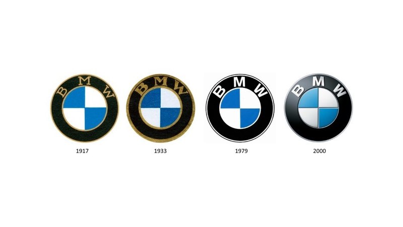
Avoid trends, think long-term because trends are temporary. In this case, find the fine line when choosing design elements that seem evergreen. A good logo can represent the company for many years. From this perspective, don’t use what is trendy at the moment in order to save money on redesign.

The last useful advice
When you decide to create a new logo, ask a professional web design studio for help. There are plenty of those companies that are capable to design a unique logo. Direct Line Development one of those companies. We know all the major principles and techniques of logo design process and understand that the main objective of any logo is to stick to people’s memory.
Interbrand's new report lists the 100 brands with the highest brand value https://t.co/uTUE0v98ZW#Branding#Businesspic.twitter.com/WYJiOCzfOe
— Logo Geek (@Logo_Geek) October 4, 2018


Comments
Interesting read. I was just thinking about branding and how well Starbucks, for example, designed their logo to be unique, simple and memorable. I wonder how can the third mistake be avoided because trends come and go
I always knew that making sure your Logo is simple is key but it's no easy task. I am glad my views are confirmed. Making a Logo that does not resemble others is no easy task. Great read.
Great logos do not just happen - It i important to think ahead and build a logo for the future :)
Honestly, these are projects that I have worked on personally and the results and feedback that we have received means so much to us. To be able to keep to the simple metrics that we have put forth in this article have yielded some of the best logos that money can buy. If my clients are happy, I'm happy.
Very helpful and interesting read that helped me better understand what really takes place when creating a logo. This article was a very simple but informative read that advanced my knowledge on logo making!
All of the best brands (Google, BMW etc) have classic logos yet keep them updated. This article is a good summary of what is most important when creating a great logo.
This article is very helpful when it comes to how often big brand companies such as Nike do update their logo. A recent example is the 76ers logo where they rebranded themselves. This was beneficial because it separated their old-self to the new 76ers, who are bigger and better from what they used to be. Updating your logo is a HUGE advantage to your brand.
Your logo is one of the most important parts of your brand and it is crucial for your business to have a nice, unique and memorable logo. This article would be extremely helpful to anyone who is in process of establishing their brand identity.