
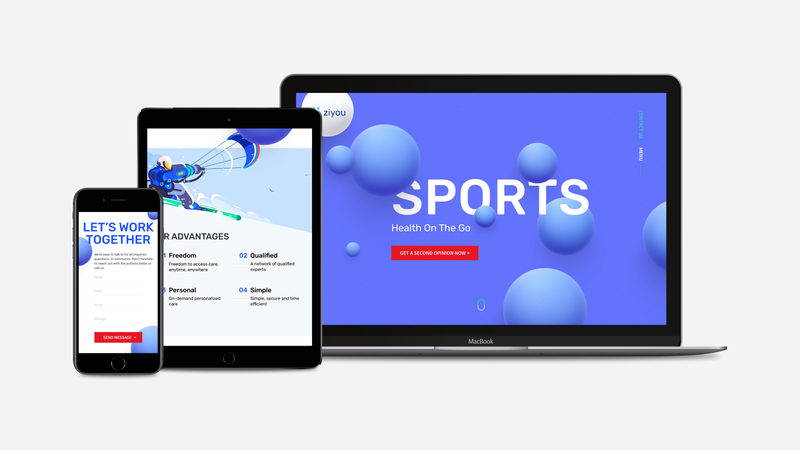
Mobile Web Development: Why It Matters
While mobile web development is not its own separate industry, it is good to talk about it on its own. This year, online mobile traffic surpassed computer desktop traffic, and now it is more important than ever to develop a fast, mobile-friendly version of a website through mobile web development. Direct Line Development is a web development company comprised of a team of specialists who will explain why you need mobile web development for your website and how we can help you achieve this.
What is Mobile Web Development?
First, let’s start with a simple question: What is mobile web development? This is when we make a desktop-friendly website work on mobile devices.
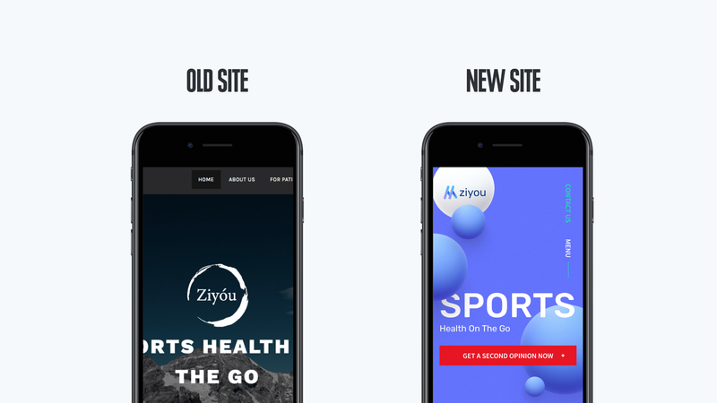
You might think it’s not that hard to convert your website to a mobile website. After all, the website already gets stretched or compressed depending on what type of mobile device you have, but there’s a lot more to it than that. When you understand what mobile web development is, you will find that the mobile version of your website must be different than the desktop version. Your users should not have to scroll or take numerous steps to get to the website’s important elements.
There are two types of mobile web designs: adaptive and responsive. A responsive web design means that the page will change based on the user’s specific mobile device. With an adaptive design, the website does not change based on the user’s device-it loads properly once the screen is locked on a specific size. Google recommends using a responsive design for mobile devices. Since we always follow Google’s recommendations for web development, all our sites are developed with responsive designs.
Why Mobile-First Web Development is the Way to Go
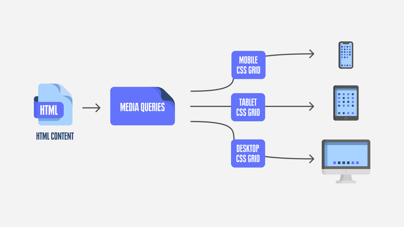
On July 1st of this year, Google began using the mobile-first algorithm to rank sites based primarily on the mobile version of the website. This has changed how we work with websites. We use modern technologies to optimize mobile-first web development, including CSS Grid and Media Queries.
A CSS Grid lets developers layout the elements of the webpage on an interactive grid. Because each element of the webpage has its own square on the grid, they will not overlap with each other when the site is viewed on screens of different sizes.
Media Queries allow developers to change the width of the webpage when it is used on different size screens.
Creating a mobile version requires first-class developers, UX, and SEO specialists working together collectively to make your site fast, reliable, and easy to promote. There are several factors a team considers when doing mobile-first web development:
- Functionality: It may be difficult for your users to perform the complex functions that they do on their computers on mobile devices.
- Multiple designs: When you are optimizing your webpage to work on a mobile device, you need to have multiple designs for every page on your website.
- Behavior: Mobile pages will not behave in the same way as desktop pages. If you have content-heavy pages, you may need to break them up into multiple pages. This requires more work.
- Design: Touchscreens behave differently than a computer mouse. You can’t just turn your desktop pages into mobile pages because mobile devices are smaller and require a vertical application.
Benefits of Mobile-Friendly Web Development
You can see from all these examples that mobile web development is more than just compressing your website. Mobile-friendly web development has several benefits, including:
- faster loading speeds
- improves your SEO
- attracts new clients
- brings more visitors from social media platforms
These benefits mean cross-platform and mobile-friendly web development should be a priority for your website.
Choose Web Development for Mobile Devices and Boost Your Business
Choosing professional web development for mobile devices can help you build your business. Ask yourself: Will my users want to do everything on mobile-optimized sites that they do on a desktop? The answer is no, not likely. For this reason, if you aren’t already thinking about responsive web development for mobile devices, you should be.
To learn more about how you can best develop your website for mobile devices in Austin, TX; Denver, CO; or Philadelphia, PA, contact us today.
Call us now


Comments
Thank you, guys, for sharing this great article! There are a lot of points in the article I really find interesting, like the difference between adaptive and responsive design. And most importantly, I’ve learned that Google pays attention to whether a website is optimized for mobile devices or not, well, I’m on my way to add responsive design to my website!