Skip ahead
- Correct Website Headlines
- Create a Unique Landing Page For Each Service You Offer
- Be Sure to Use Videos
- Act Like a Developer: Test Everything
- Add Your Partners’ and Customers’ Logos to your Homepage
- Change the Color of your “Call to Action” button for each new page
- Remove or Hide Promo Code Fields
- Do Not Write in Large Font
- Do not force the user to register before making a purchase or ordering a service
- Be Brief
- Bringing it Home
Welcome back to the continuation of our series on how to increase customer conversion from your website. If you haven’t read the first article, we strongly recommend you do so before continuing on. We would also like to mention that we have incorporated all of these techniques into our own clients’ websites, so we speak to you from first-hand experience. All the web design techniques mentioned in this series are known for the results they bring. Feel free to check out our portfolio for details. With offices located in Philadelphia, Denver, and Austin, we at Direct Line Development take pride in the work we do for our customers.
11. Correct Website Headlines
The best websites maximize every opportunity to attract and convert shoppers into buyers. The headlines on your website are an excellent opportunity to deliberately captivate the attention of your customers and motivate them to take action. Correct use of headlines contributes to an overall better reception of website design in general. You don't need to be a professional designer to make this happen. Let’s take a look at how your company can create a professional and effective title.
A good title or headline incorporates the following:
- The title is interlinked and consistent with the text on the banner or ad from which users accessed your site
- The title briefly and clearly presents and explains the benefits to your customers
- The title is concise without adding unnecessary “fluff”
- When compared with the headlines of your competitors, you can clearly see the advantages of your company
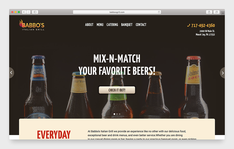
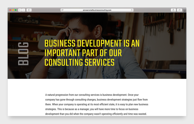

If your headlines or titles are bland and/ or uninformative, then you must immediately make the necessary changes to bring the best results. We would also like to mention the negative effects of poor headline use. If you fail to demonstrate to potential customers what the contents of a page entail through headlines, you risk confusing them or evoking their lazy natures. When this happens, your customers will likely leave the page or as it is known in the web development community, they will “bounce” from your website.
Bouncing is extremely costly to your website and to your business because Google is able to recognize when it happens and act accordingly. Too many people bouncing from a website signals to Google that the site is flawed in some capacity. When it comes to this realization, it penalizes the site with a lower ranking in it search result listings. To avoid high bounce rates, be sure to implement effective headlines. The other tips and tricks in the article and other will help you hedge against user bouncing and stabilize - or even increase - your rank in Google.
12. Create a Unique Landing Page For Each Service You Offer
One of the most common themes to keep in mind when exploring the world of website design is the overwhelming (yet unsurprising) fact that people are lazy, as we just mentioned. They want to know exactly what they what to know, exactly when they want to know it. If they have to work harder for information than they would like, they will go somewhere else that requires them to work less. Therefore, if your website offers an abundance of useful information but in a disorganized fashion, you will lose potential customers. It is because of this point that we advise that you give each service and product you offer its own page on the website. With more room and less clutter to work with, the chances of your users finding exactly what they are looking for quickly and easily increases ten-fold.
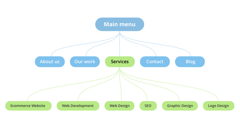
This may sound like a lot of work and even counter-intuitive because of the increased amount of pages your website will have. It is true that if done improperly, this could have adverse effects for your SEO and UX on the site. However, if you structure each landing page so that they logically flow from broad to specific, you will see excellent results and your firm will benefit. Landing pages give the website and organized structure and make it easier for your customers to find what they are specifically looking for. We have all been the victim of a website with all of the company’s information listed on one page. Chances are, we saw the wall of text, read the first two sentences (if that) and immediately returned to Google to find the information we were searching for elsewhere. It’s not that we didn’t believe that the website had the information we were looking for, it’s simply that we did not want to expend the time and effort to find it.
13. Be Sure to Use Videos
Videos are increasingly popular not only for the reasons presented above but also because of the rapid advancements in technology that increase their quality and capabilities. Most of us have already forgotten the days where the internet was too slow to watch videos online. Now we take it for granted. Take advantage of the universal willingness to watch your videos and appeal to your customers at a more personal level. If your website is responsive, your users will be able to easily view videos from multiple devices, improving your customer reach even further. Again thanks to technological advancements, you don’t even need to hire a professional to get the quality you prefer. Most cellphones from the latest generations of devices have video capabilities that are more than sufficient for you to make a video for your website. Just remember to approach the video-making process with a plan.
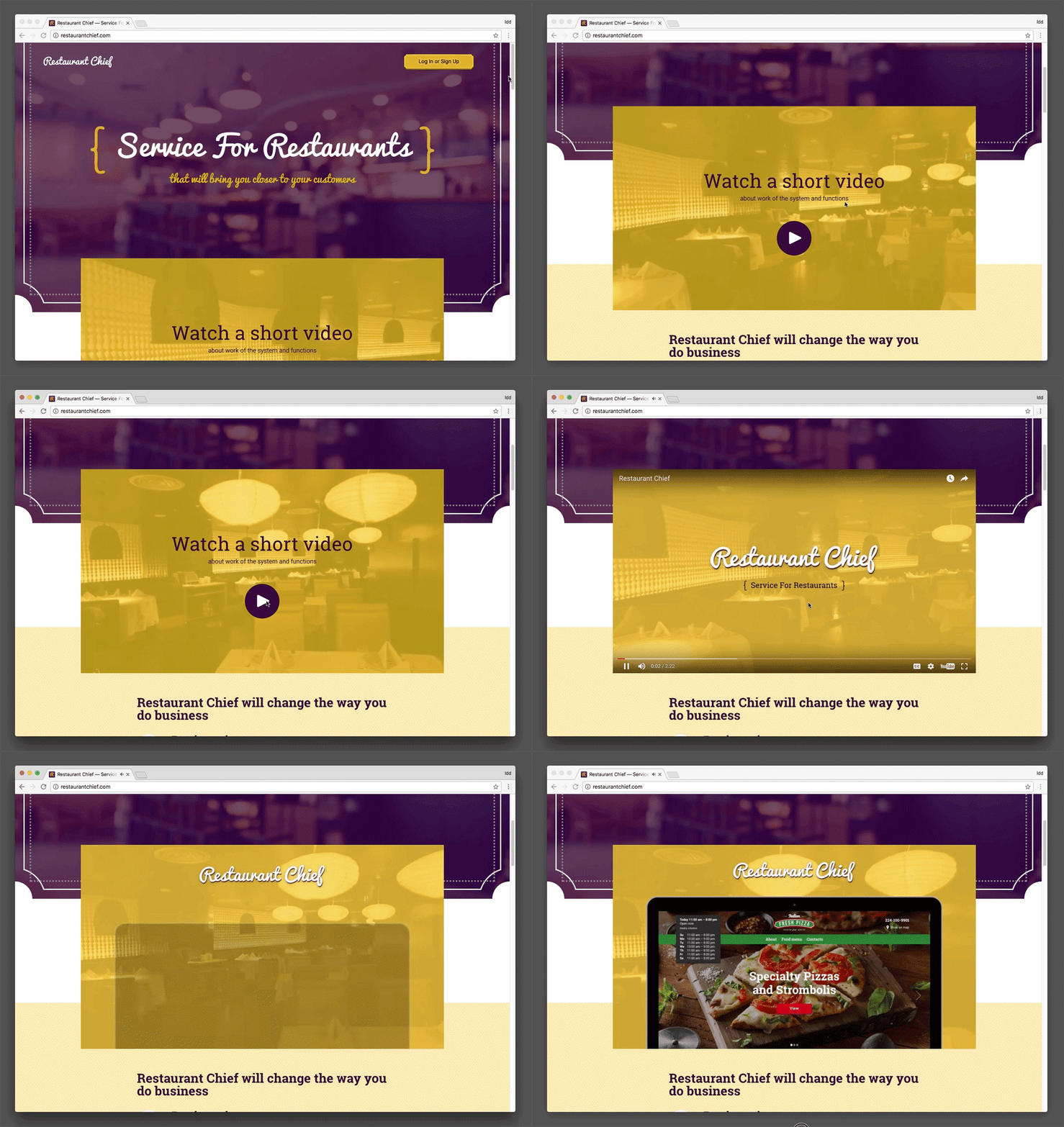
Using videos also has a positive effective for search engine optimization. Good search engine result rankings take into account a variety of factors, one of which being the average length of time users spend on a particular website. We discussed the perils of bouncing just moments ago, and videos are a great way to prevent high bounce rates, seeing how they keep users on the website for at least the duration of the video (assuming the video is an optimal length and well-constructed). Further, good web developers are actually able to optimize each video specifically for heightened SEO results and customer conversion rates. For example, we like to incorporate aspects of Philadelphia, Denver, and Austin in our works not only because of the feelings of familiarity they evoke in people local to the area, but also to cast a wider SEO net. If done correctly, videos can serve as an excellent addition to your website.
14. Act Like a Developer: Test Everything
Let’s say you finally got that new payment portal integrated or you just updated the photos on your site. Now you’re finished right? Wrong. Go to your website from someone else’s phone or computer and test it. More often than not, you will find an error that you were previously unaware of and will be able to fix it before the wrong set of eyes notice. It’s even better if you have other people test the site. If you just stand by and watch as they go through simple processes such as registering, making a purchase, etc., you can easily see where changes should be made. Testing is like proofreading. The most competitive students would never spend hours upon hours of research and careful writing only to submit an unedited draft, so treat your website the same way. The last thing you want is to have a miniscule error steer a potential customer away who would have otherwise sought to do business with your company or firm.
Also be sure to test the website on multiple devices if it is responsive. Responsiveness implies multi-device compatibility, so you should ensure that this is indeed the case. If you aren't sure if your site should be appearing on a device in a certain manner, it's best that you talk to a developer to make sure.
15. Add Your Partners’ and Customers’ Logos to your Homepage
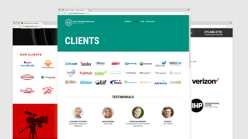
We trust those who are trusted by large companies. If your clients are companies whose brand recognition is far beyond that of your own, it is an incredibly good idea to list them on your site in some capacity so that potential customers see them, especially if customers will be making purchases (i.e. you have an ecommerce site). The reputability of these companies is then passed on to your own. This is a common web design tactic and something a top designer understands fully. We would advise, however, that you get permission from these companies prior to posting their links on your website. It usually is no problem, considering it is additional publicity, but it is better to protect yourself on all fronts than take avoidable risks.
16. Change the Color of your “Call to Action” button for each new page
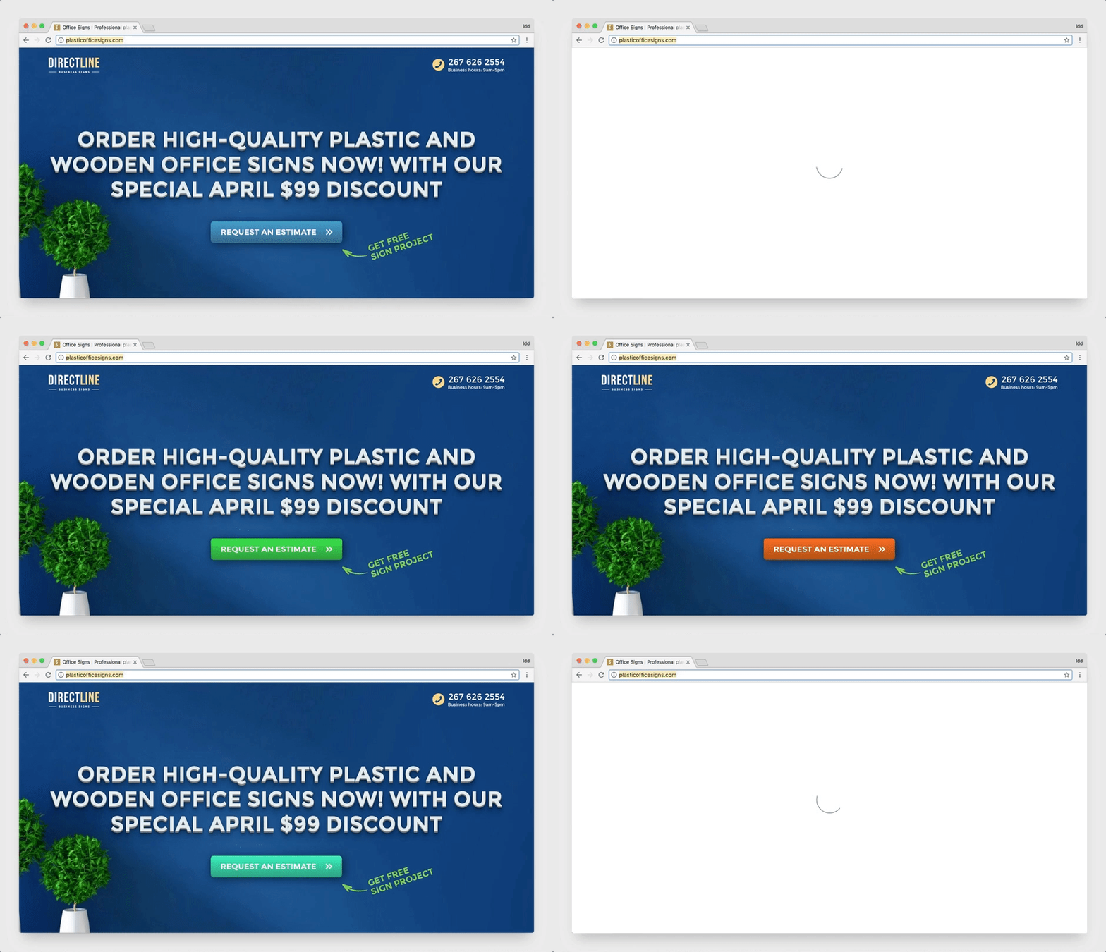
Sure the first time you see it, the bright green button may stand out, but after consistent browsing throughout the site, it will begin to blend into the general design and lose its purpose. By constantly keeping visitors from becoming familiar with the Call to Action button, you will ensure that it is functioning at its highest probability for success. This is doubly important for ecommerce websites.
17. Remove or Hide Promo Code Fields
Every time we see these fields, we embark on an emotional rollercoaster. It’s always the same story: we see the opportunity for a discount, rush to Google in hopes of finding a valid code, try several of them, and get nothing but lost time because each code was outdated. Unless you are consistently offering workable promo codes, all you are doing with a promo field is creating a sense of deception in your clients. It’s best to say “goodbye” to the promos.
18. Do Not Write in Large Font
The larger the font, the higher the perceived price. Keep it simple. Let the customer come to you.
19. Do not force the user to register before making a purchase or ordering a service
As a business owner, what is most important to you, the more people you have registered to your site or the more sales you make? The answer is obvious. It is a very common, yet detrimental mistake to have potential buyers fill out field after field before making their purchase. More often than not, this will drive users away. The last nail in the coffin is the confirmation email. Your number one priority is to make the sale first. Once your customers have already purchased from you, it will be much easier to harass them with membership opportunities as you please. Always make the sale first.
20. Be Brief
All of us, whether we are business owners in Los Angeles or website design companies in Philadelphia, Denver, or Austin, love to talk about what we can offer. This excitement is great and should transcend every action you take in business, but it can lead to an unnecessary amount of information on your website. If your site is clogged with text, your visitors won’t find what they are looking for fast enough. If your product has 25 amazing characteristics, choose the top five and write information on these. If you write up the content for your site and it comes out to around 1000 words, you might as well throw it away, because no potential customer is going to take the time to read it. It’s best to keep that as a first draft and rewrite a new version that comes to about 200-300 words.
Bringing it Home
All of the above-mentioned methodologies are techniques that we employ on a day-to-day basis. The beauty of web design is that you can constantly find newer and better ways of doing things. It’s one of our favorite parts about the job. We can constantly improve the quality of our customers’ websites and thus, their businesses. Our web design agency offers affordable pricing and solutions for everyone we work with. If you are curious as to how your site stacks up against the rest, give us a call and we will run an audit of your website absolutely free!


Comments
Every business is interested in getting more calls from potential clients. This article describes some very strong and effective techniques which can definitely increase the numbers of those calls. The best part of it that all the steps are simple and can be followed by any business owner who has a website.
These is a great Blog to follow when building a website for success. You want clients to call you, email you, or simply fill out a form for you to contact them? These things can not be accomplished without CALLS TO ACTION.
What response are you trying to elicit from people visiting your website? The placement, color scheme, and the flow of the site are imperative. No one has a website this days just because... You are either informing your visitors of who you are and what you do, what's new, trying to get more clients, or both. If you are not building your site with these things in mind you just have a pretty site...
Very good article that can help you drive interest from your website. Who doesn't want more customers?
Interesting ideas, especially the one about Landing Page structure. Including services that are displayed on the main page of a website prompts users to click on them to learn more, but also go back and see what other services are included because they're all are mentioned on one page and go from broad to specific - very logical and makes sense.