Skip ahead
The internet is a battleground for businesses who use SEO copywriting services to come out on top when industry-related keywords are researched. Who doesn’t want to end up featured in a Google search? The problem being presented is the lack of engagement with traditional blogs and content – they become under- or over-optimized at times.
How can your business overcome the obstacles and limitations presented during marketing?
By using infographics for marketing, your business adds a unique quality to the content put on the internet. Not sure how to incorporate this strategy into your business’ content? Let us explain what a marketing infographic is, how it works, and what it can do for you!
What is Marketing Infographic?
The term infographic describes images, targeted text, and charts that provide a special marketing language requiring few words. Still, it brings a multitude of wealth to your content to get your point across.
Let’s look at an example of a marketing infographic.
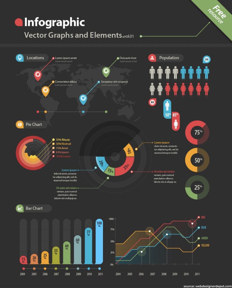
What do you notice about the above infographic? Bright colors and easy-to-read designs? This marketing infographic draws you in with visuals that flow from the top to the bottom. It is no surprise that using a marketing strategy that includes infographics are more popular than those without them.
If you want your content marketing infographic to get noticed, there are components that you should be sure to incorporate.
- Graphics – The graphics used for an infographic are the foundation of the message you are trying to bring to your consumers. If your graphics leave a lot to be desired, so will your overall message.
- Valuable Information – There is such a thing as useless information. When you use an infographic, you want it to stay on topic and have valuable information without a lot of fluff. You can use infographics to help target a specific audience by including the information that the group finds valuable.
- High Level of Organization – You can consider organization the recipe to success with an infographic. Kind of like when you are baking a cake, you have to follow the directions to achieve an edible treat at the end. You can’t just throw all the items in a bowl without the proper measurements. The same applies to your social media infographic – throw it all together, and you may end up with a mess!
- Real-Time Data – Even if you are repurposing older content with infographics, use data to support it. Not just any data will do. It should be relevant to the topic and as current as possible. Your credibility depends on your accuracy.
- Design and Concept Roles – When creating an effective infographic, the idea is to design around your concept, not create your concept around a design. Even if your marketing infographic isn’t an obvious advertisement for your business, it should still hold true to your concepts and represent your business.
Creating a useful strategy with infographics for marketing should grab the consumer’s attention, draw them in, present the point, support it, and make them want to share it. In the world of marketing strategy infographics, less is more.
Why Use Infographics?
The point of a digital marketing infographic is for it to speak for itself. The graphics that you use should make your point with minimal need for explanation. As an example, let’s look at the following infographic:
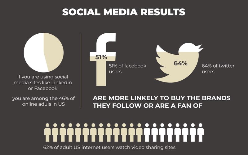
What do you suppose the point was for this? Here is what we can gather from this infographic:
- This is likely an influencer marketing infographic – it features the recognizable logos of Facebook and Twitter prominently displayed in a complementary color.
-
Charts are used to depict percentages that are crucial to the creator’s point. They want to prove that:
- Social media sites like LinkedIn and Facebook are used among 46% of the adults online in the United States
- People who are followers of a specific brand on social media are more likely to purchase them (51% and 64% to be exact)
- Of all of these adult internet users in the United States, over half (62%) utilize video sharing sites
- The relationship between the colors and the dark banner representing the percentages of the users paints the picture that social media drives results, especially from a branding perspective.
The purpose of this infographic was to draw in the reader and to point out percentages that may drive them to look at social media for marketing strategies. Most social media infographics are made to be mobile-friendly or used for print purposes, so adding a marketing infographic works for websites and mobile sites.
When Should I Use Marketing Infographics?
Using a digital marketing infographic can be done when you need to get a large amount of information to consumers using minimal amounts of text. These also help when you have large amounts of text, including complicated subject matter that may not be easy to understand. Even consumers who are seeing information about something for the first time can become comfortable with the information after using an inbound marketing infographic.
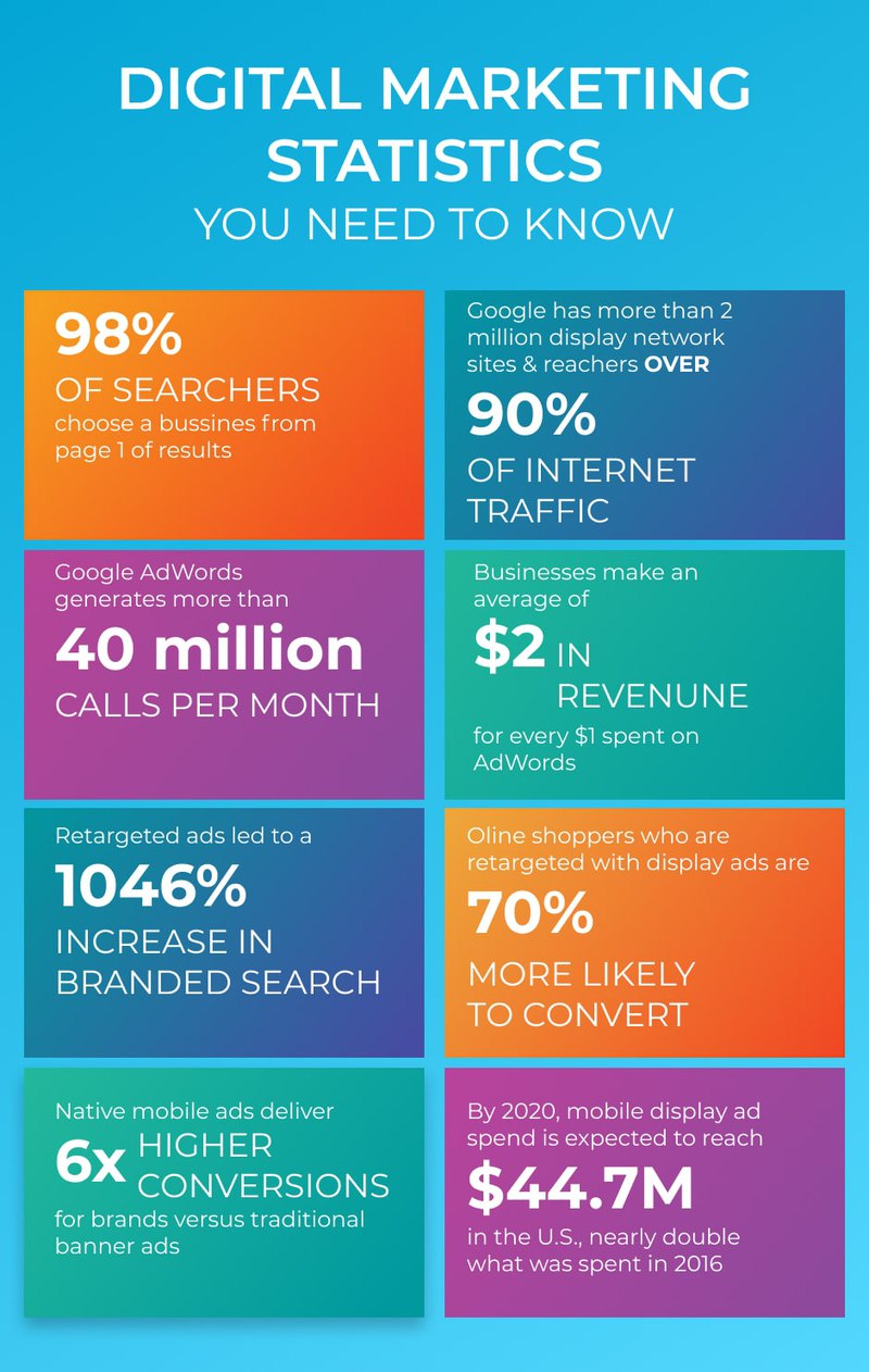
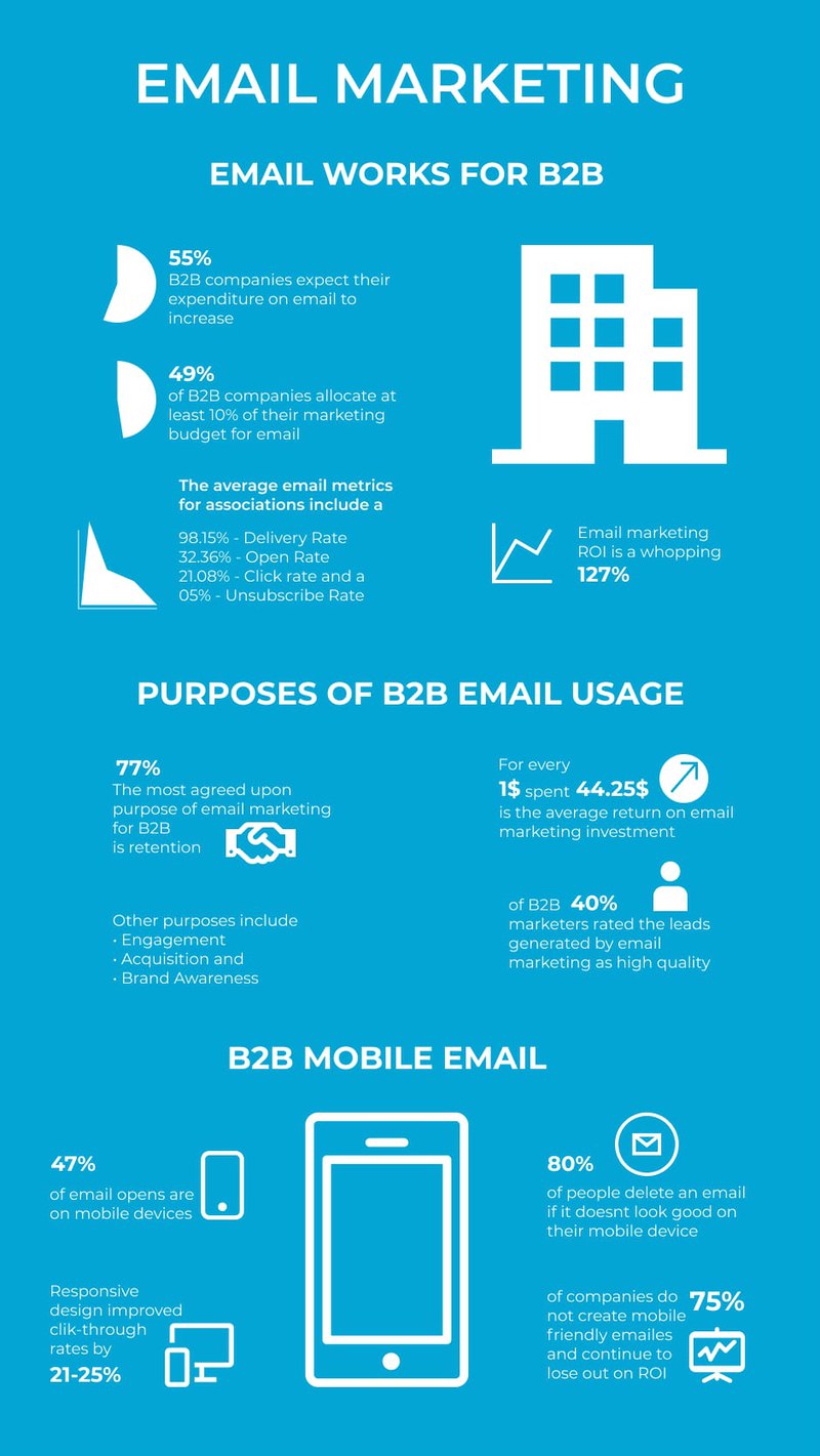
Approaching the above infographic as a consumer, you can make some inferences. There are very large numbers associated with small pictorial descriptions of the written text. These small pictures have the ability to say more than words do.
Visual marketing infographics like the one above can say a lot more to someone who has little time available than a post with over 1,000 words. A good infographic should be used when you want to make a point with as few words as possible. The use of an infographic doesn’t mean that you don’t need to finish the blog post or content about the subject, it just provides your audience with an alternative idea of the contents.
How an Infographic Helps with Marketing
The benefits of digital marketing for small businesses infographics - it brings awareness to your business. You pull out all the stops to promote your business – from SEO to cutting edge marketing infographic designs. These are all ways that you get your brand out there for the world to see.
Using infographics for marketing can help draw the consumer’s attention to a point on your page with targeted information. How many times have you gone to a website and scrolled down until you see the pricing?
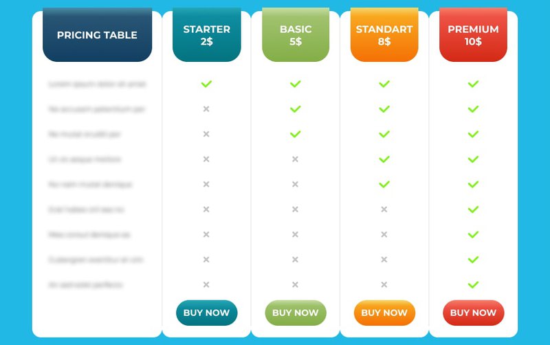
Infographics that get straight to the point help consumers make positive decisions regarding your brand. No one wants to play a game of seek and find to get general information, like pricing.
Marketing extends beyond a company’s website. Social media marketing infographic shares count toward a lot of a brand’s exposure online. People are more likely to share your infographic than they are your article. If you want to get your brand shared, choosing an influencer advertising infographic approach may be in your best interest.
What are the Benefits of Using an Infographic?
Infographics are like a double-edged sword for your business. They will either help your brand or hurt it – it all depends on the structure and strategies used. When used effectively, internet marketing infographic can be extremely beneficial.
An infographic that creates lead generation for your brand is the ultimate goal. So, what are the other benefits of infographics?
- Demands Attention – A well-constructed infographic doesn’t just catch the eye of a consumer scrolling along – it demands attention! Colors that grab attention are more likely to catch a few more lingering eyes than long, drawn-out texts.
- Lures Consumers – The pop of color or the creative graphics that target a specific audience is likely to lure those consumers to your site and your brand. A digital marketing infographic is like a trail of sweets that lead back to your brand. The consumer has seen your infographic and is enticed by it. Now they want to see what you have to offer them.
- Enhance SEO – You want to rank high on Google, and good infographics are often shared more than anything else on the web. These shares are seen by Google and can increase your rating within the search engine.
- Break Down Information – Infographics do exactly what the name implies. They are graphics that supply info. When you choose to use a digital marketing infographic, you break down the information you want the consumer to know in bite-sized pieces that they will likely understand. This gesture will make the consumer regard your knowledge on the subject matter on an expert level.

Effective Infographics
In marketing, there are good infographics and bad infographics. How do you know what ones are good and which ones are bad? An effective social media infographic simplifies a concept, tells a story, and is aesthetically pleasing. The target of your online marketing infographic plays a huge role in approaching its design.
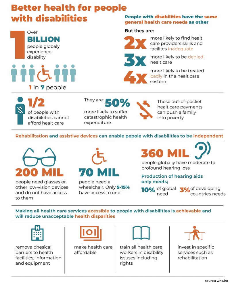
Even though the above infographic seems a bit busy, it still catches the reader’s attention within the first section of information. If the reader is hooked at that point, they are likely to continue reading the infographic. A good overall impression may lead to a social media share or two.
The audience for this infographic is likely aimed at people working in the healthcare industry. There wouldn’t be much value in this infographic for someone who works in the entertainment industry. The above infographic will likely find itself shared in an internet marketing infographic circle centered around health and insurance. If that was the intended purpose of the infographic, it meets the criteria of an effective infographic.
Types of Infographics
There are many different types of marketing infographics you can use:
- Statistical infographics
- Informational infographics
- Process infographics
- Timeline infographics
- Anatomical infographics
- Hierarchical infographics
- List infographics
- Comparison infographics
- Location-based infographics
- Visual resume infographics
To choose the best strategy of marketing infographic for your business, compare all the types and choose the most suitable.
What Makes a Good Infographic?
Think of a good infographic as four overlapping circles – data, design, shareability, and storytelling. In the middle of these circles is the definition of a good infographic, which has an equal division of all four aspects.
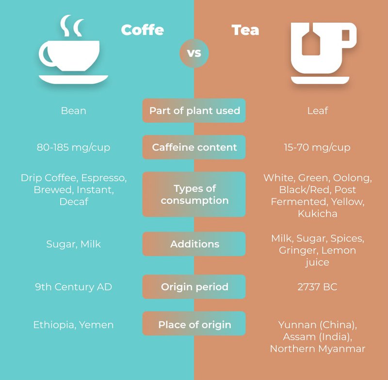
- Data – The marketing infographic data provides the facts about coffee and tea in a separate format for easy comparison.
- Design – The infographic layout is simple enough but provides a multitude of information to the reader. Even the colors provide a coffee and tea feel.
- Shareability – The infographic is fun and possibly meant to target an audience who may be swayed to the coffee or the tea industry. It also gives information that will help an audience who likes both understand the differences and similarities.
- Storytelling – Although it isn’t a traditional “storytelling” type of layout, this visual marketing infographic takes you on a trip through the history and composition of coffee and tea. You get the beginning to end in one picture with minimal text to read.
All of the information is evenly distributed, meaning that this infographic would land right in the center of the overlapping circles. When the four components are not equally distributed, that is where problems pop up.
For example, suppose your infographic has an equal distribution of data, storytelling, and shareability but lacks design. In that case, it may come across as amateur. If it lacks storytelling, it may be seen as boring. The same issues pop up if two areas have a larger focus. The other two lacking areas raise potential problems for the entire infographic – and your branding.
What Makes a Bad Infographic?
You might think that an explanation for a bad infographic for marketing is simply the opposite of a good infographic. While the theory is good, unfortunately, that isn’t quite the situation. It is easier to create a bad infographic than it is to create a good infographic. Therefore, there is more room for error during the creation process. You can’t afford mistakes when working on a marketing plan infographic.
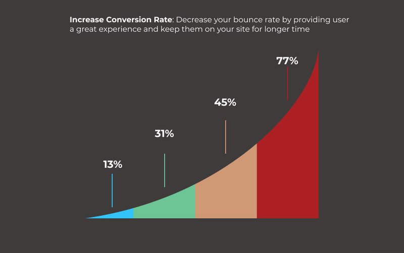
Would you share this chart on your social media? It’s okay. We wouldn’t either. There is no axis to indicate actionable data, nor does it tell a story. There is nothing to indicate the true message of the chart.
Can you spot the problem with this social media infographic? The monochromatic color scheme could make this difficult for someone with colorblindness to differentiate the colors. Did you know that approximately 1 in 12 men is color blind? Choosing a monochromatic color in a shade that might be hard for differentiation isn’t the best business move if your brand is geared toward males. You don’t want someone to work harder to read your marketing infographic.
Components of a Marketing Infographic | Good Infographics | Poor Infographics |
| Data | Factual information, reliable, timely | Underachieving, invisible, untrusted |
| Design | Readable, consistent theme, appropriate colors and fonts | Boring, Unprofessional |
| Shareability | SEO content, social media-friendly, viral, location-driven | Damaging to branding, drive away potential customers |
| Storytelling | Engages readers, sends a clear message, gives a problem that needs to be solved | Branding could appear amateur, could be embarrassing for the overall company atmosphere |
Best Practices for Marketing Infographic Designs
There are six best practices a brand should follow for a truly engaging and successful digital marketing infographic. Here are the things you need to know before you begin your infographic campaign:
- Focus on a single topic. Focusing on more than one topic can cause confusion and undermine the entire purpose of the infographic.
- Don’t use text to talk too much. The best infographics let the graphics do all the heavy lifting.
- Ensure your marketing infographic flows. There is a proper order to things, and if your infographic is out of order, it defeats the purpose.
- Choose your fonts wisely. You should never choose two fonts from the same classification to make a point. Understand the power of fonts (serif, sans serif, script, and decorative) and how their sizing can impact your overall message.
- Use colors that compliment each other. When in doubt use your brand’s colors as a basic scheme. Unless you want to make a bold impact, stay away from overly neon selections.
- The footer says it all. Within your social media infographic footer is all the pertinent information you will want to include – data, company name, brand logo, call-to-action, and any relevant URLs.
By incorporating the best practices and the four components of a good infographic, you can design your own infographics that not only get shared but drive lead generation for your brand.
How To Use Infographics
What are infographics used for? There are different ways of using it in your business.
Educate Your Audience About Your Business
Between the best practices and good infographics, educating your audience about your brand will come naturally. You won’t have to put in the extra energy to supply additional information because your marketing infographic will tell them everything they need to know. You don’t have to put in every detail of your brand either. Highlight the information that you want consumers to take from your infographic.
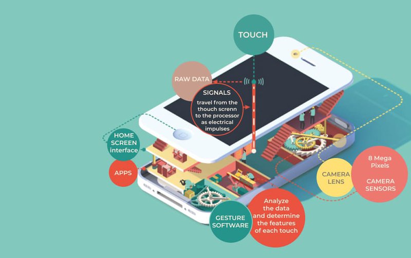
Pretend that your brand is marketing a cell phone design. You make an infographic for marketing much like the one above. You are educating your audience on the key features, how it works, and what the components of the phone are. The illustration alone is enough to convey the inner workings of the phone but in a way that makes it less intimidating.
Not only will your audience see your product, but they will be able to see that you are an expert on the subject matter. Your marketing strategy infographic goals are complete.
Use Credible Sources
Why are infographics effective? It can be proved by credible sources.
To create a workable marketing infographics use credible sources. Use facts and statistics data to provide customers with reputable information. But ensure that every information you use on your website is recent and can be proved by reliable sources.
If you prefer using quotes as a social media infographic to boost the credibility, choose these that are credited to industry experts and thought leaders.
Write The Content
The text for marketing infographic needs to be succinct enough to support the visual elements without drawing attention away. Hire a professional copywriter who has the experience at writing infographic content. Use narrative to have a logical text, otherwise it may seem as a bunch of disconnected data points and a confused audience. The headline needs to be attractive to make an impact on your customers. The social media infographic should move the clients from one section of your site to another, and the headlines will help you.
Finally, check the content for spelling and grammar mistakes. Often even the slightest error can discourage customers from further browsing
Make The Best Design
Design isn’t just about creating a beautiful aesthetic—it’s also about functionality.
Social media infographics should be brief and concise. Few people are attracted to overloaded images. Always leave space around the edges-so you bring more order to your social media infographic.
Infographics are usually 800-1000 pixels wide and much longer. If you need to add more content, expand the infographic vertically rather than horizontally, as unusually wide infographics will be harder to share.
Choose colors and fonts that fit the theme of the site. Don't paint an infographic for marketing about shipbuilding in bright, garish colors, or a site about floristry in black and white. Do not be afraid of contrast and choose a color scheme of two or four colors - but do not overdo it, the more colors, the faster customers' eyes can get tired and they will leave the site.
Infographics of any type and size can be used for data transfer, from classic examples to unique designs. The importance of infographics in marketing is in it's clarity and recognizability.
For easier understanding of the site, you can use already known and clear icons, and it does not matter whether they are the fruit of your ideas or you took them from another site.
Since your marketing infographic will be intended for an outside audience, you don't have to worry about overtly branding it. Instead, just put your company logo and web address at the bottom of the infographic next to the sources.
Boost Your Brand’s Social Sharing
Who are you trying to reach with your infographic? There are over seven billion people out there, and you have already learned that the majority of them use social media or a form of online search. What does it take to boost your brand while gaining social media shares?
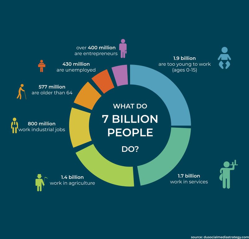
Looking at the social media infographic, you see data, design, storytelling, and shareability. The fact-driven data, indicated in the footer, comes from three separate sources. The brand’s logo is also present in the footer. There is not an overly promotional feel to this infographic, either. There is an abundance of knowledge in this infographic that can be used for various marketing purposes.
When trying to reach a specific audience, it is good to know just how many of them are in the sector. Who are you really aiming for? If 430 million people are unemployed and over 400 million people are entrepreneurs – do you want to target both using an influencer marketing infographic to influence both?
The other part of this infographic is that it is shareable. When you come across something on social media that you feel has value, you share it. This infographic is one that can benefit multiple brands without being overly promotional.
Your Online Marketing Infographic Will Define 2022
It may seem rather presumptuous to say that your online marketing infographic will define 2022 for your brand, but it’s not. People are spending more time doing online searches and visiting online sites than ever before. The events of 2020 have forced brands to redefine how they approach their marketing strategies.
Now that you have an idea of what it takes to create the ultimate campaign for your marketing infographic strategies, you should be able to implement them with content you already have available. Take a look at your blog catalog. Do you have posts that saw little to no interaction and lacked infographics?
Repurpose! Redefine! Relaunch!
If you aren’t a digital marketing infographic guru, no worries, using a website development company that specifically handles infographics and other SEO matters exists. As you look through the companies available, make sure you pay attention to the previous work they have completed. A good infographic speaks for itself (without words).






Comments