
New Case Study: Creating a Reptile Website Design That Helps Clients Grow
Reptichip LLC is a Texas-based manufacturer of unique coconut bedding for reptiles. When they came to us in late 2019, they weren’t happy about their reptile website’s design and performance. The company wasn’t getting a lot of leads due to the outdated look of their site that wasn’t clearly communicating to the visitors what their products are all about.
Here’s how we helped them turn that around.

How to Build a Reptile Website from Scratch: Our Action Steps
The best reptile supply website is one that brings in more customers. Here's how our redesign helped our client generate new leads.
Identifying the Problem
What became apparent for us in the process of analyzing the client’s old site is that it was simply not interactive and engaging enough. It looked dated and not… fun. Reptichip makes products for reptile owners, not your regular cat or dog lovers. They offer a unique product for unique people, and we wanted the site to clearly show that. In addition to that, the site looked cluttered and disorganized.
Finding the Right Solution
Our team wanted the new reptile website i to:
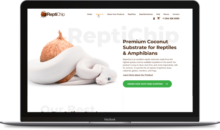
- Be clean, simple, and highlight the product
- Be convenient and easy to use
- Keep in line with the client’s branding
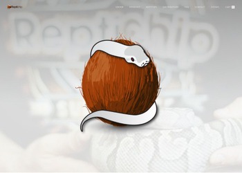
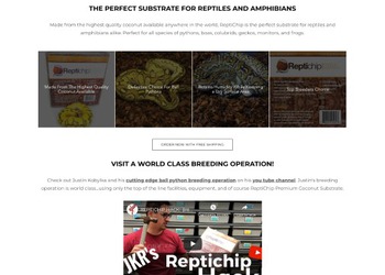
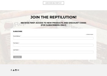
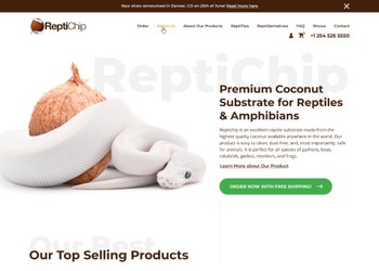
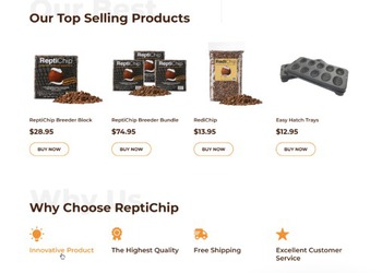
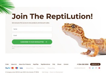
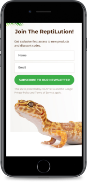
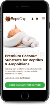
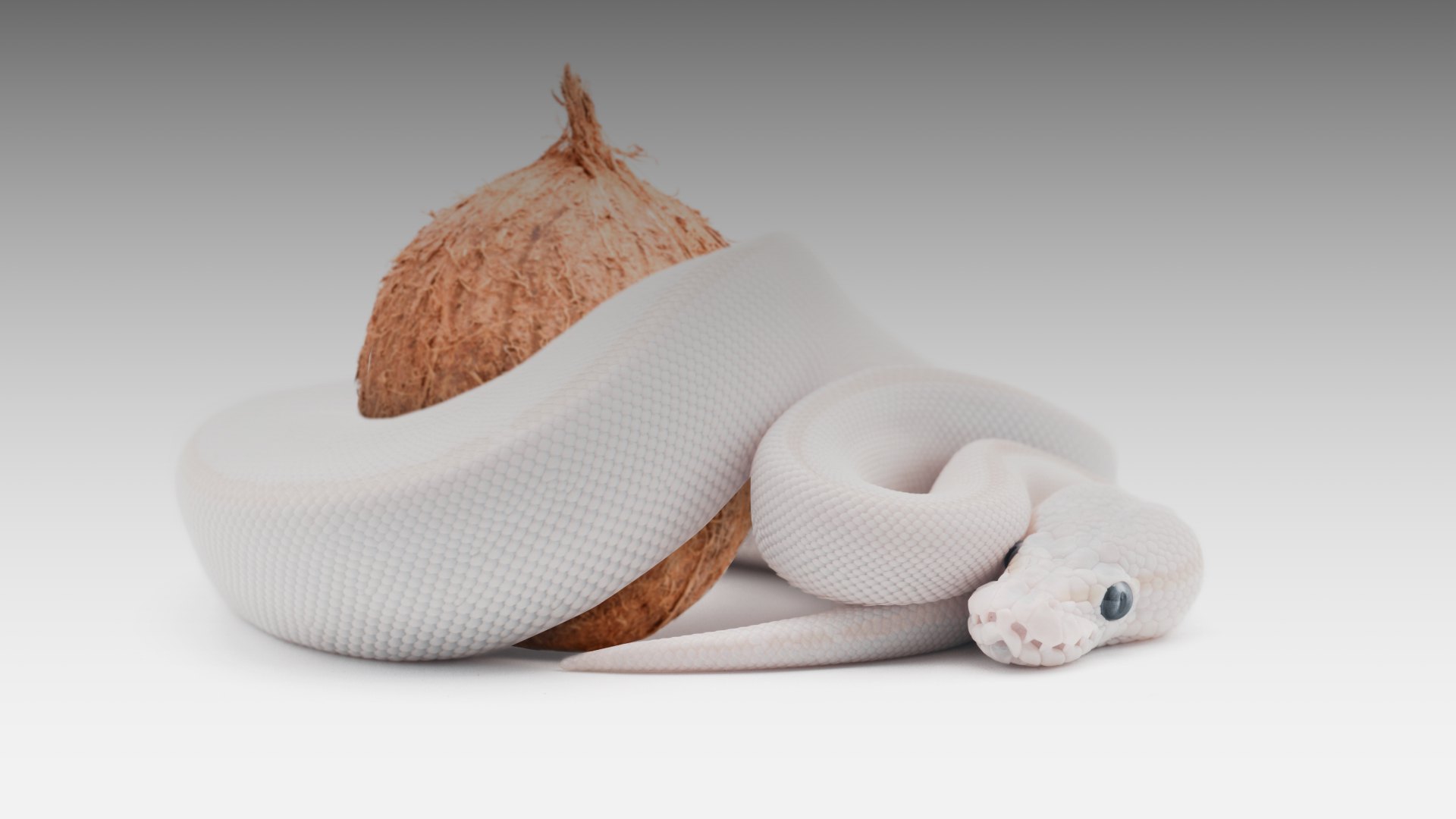
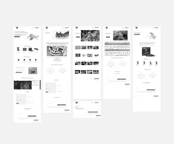
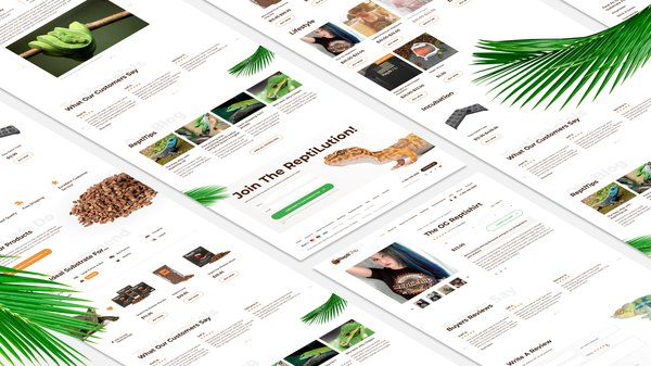
After a brainstorming session, we decided that Reptichip’s logo - a white python wrapped around a coconut - is a powerful enough image to put at the center of our design concept. We added more photos of reptiles and scattered more bright visual elements throughout the pages. The background of the site is white, which makes all the images and call-to-action buttons stand out fairly well. The type of design is very to the point, and that’s exactly what the client wanted. Still, the reptile website design stands out in the sea of samey-looking outdated designs by being stylish and allowing for a smooth user experience.
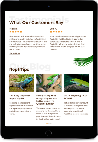
The latter was achieved by making the site responsive. A responsive design responds to the environment in which it is being viewed. This means that whatever your choice of device is, the site will adapt to your screen resolution, thus making it easy to scroll through the pages.
How This Helped
The truth of the matter is, the better your reptile website looks, the more likely the visitor is to stay and actually have a look around. Just stuffing your site with keywords won’t do much - it can actually make things worse for you as Google and other search engines can flag your site as spammy and penalize it.
Our advice is to focus on improving the user experience throughout your site: update and simplify the site structure, add engaging, interesting content, and ensure that the site can be browsed from any device. This is what we did for the Reptichip reptile industry website — and the results were not long in coming.

What Makes This The Best Reptile Website To Order Food
DLD Is Your Top Partner for Reptile Website Web Design, Web Development, & SEO
To recap, by redesigning the exotic reptile website and making it more user-friendly, we managed to attract new customers for our client. Reptichip requested a modern site with a convenient, simple structure that stands out among the competitors, and we delivered.
We can help you grow your business, too. Our team of web designers, developers, and SEO gurus can create the best website to buy reptile supplies… or anything else! Our offer isn’t limited to reptiles only. After successfully completing hundreds of web projects for clients across the US, we know what works. With 20+ of experience in SEO and web design, we guarantee that you will not be disappointed.
Get in touch for more information — let’s see how we can empower your business to reach new heights!
Our works by tag Web Design and Development


