
How to Transform an Old Therapy Web Design to Attract New Clients: a Case Study
These days, your website is your business card, and the first impression it makes will determine whether visitors leave it or get in touch. This is true for every industry, including therapists. Our client Angela, the owner of Transformation Therapy, LLC, wanted us to completely revamp her therapy web design to create a site that would not only make it clear who she is and what she can help with but also provide an overall pleasant and calm user experience. Her old site was a visual mess with a focus on one specific service - we wanted to get away from that and create a simple, clean design with a site structure that is easy to follow.
Below is a brief rundown of our process and the results we achieved for the client.
Developing a Website for a Psychologist: Problems & Our Solutions
Here are the problems we faced when creating a website for our psychologist client and the solutions we came up with.
Problem 1: The Site Isn’t Visually Impressive
The main issue with the old site was how unremarkable it was. Like we said earlier, you need to impress new visitors or they’ll leave your site immediately. After all, there are plenty of effective psychotherapy websites out there that use various visual tricks to lure in new customers.
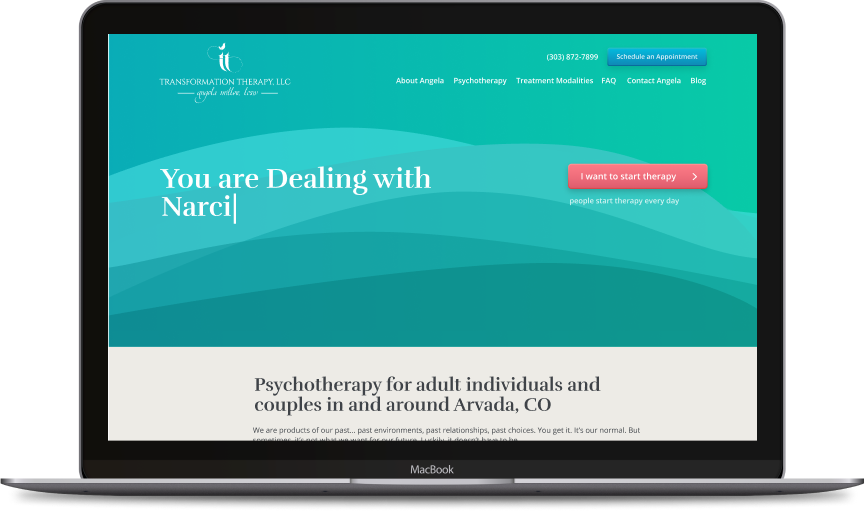
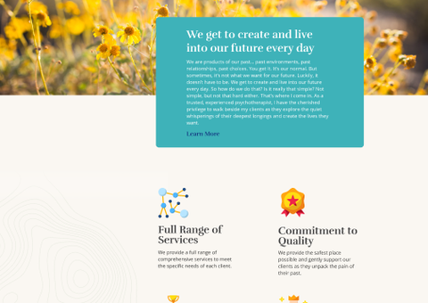
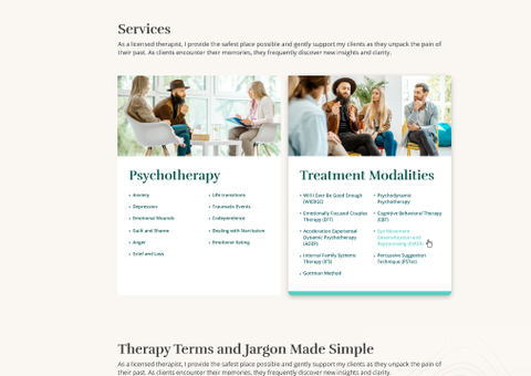
In order to join the ranks of the best psychologist websites in Colorado, we decided on a complete makeover, starting from the main color scheme. After a brief brainstorming session, we chose a neutral combination of light beige and various shades of turquoise. To highlight the banners and call-to-action section, we used brighter colors. The color palette is not too flashy but also not too boring, creating a calm, comforting atmosphere throughout the site.
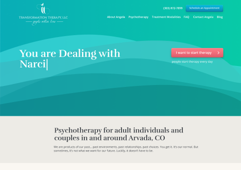
We also added an animation to liven up the homepage. One of the first things visitors will see when accessing the site is the letters “You are Dealing with…”, followed by one of the most common issues that Angela works with. This feature immediately makes it clear that the client offers solutions to a variety of challenges and difficulties people may face in their lifetime.
Problem 2: The Site Focuses on One Service
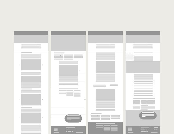
The original psychologist website design we had to work with no longer reflected the full scope of services offered by Angela, meaning we needed to completely redesign its structure. Our web development team chose to build a tree structure for this site. This type of structure is the easiest to follow as it organizes the pages into sections from big to small. The main browsing menu only includes the essentials - in our case, it is an About page, two main service pages, FAQs, a Contact Us page, and, finally, the client’s blog.
Problem 3: The Site Doesn’t Work Well on Mobile Devices
According to recent statistics, most Internet users have switched from desktop to mobile. The vast majority of websites on the net are accessed through mobile devices - smartphones, tablets, and everything in-between. Thus, it is crucial to ensure that your psychology websites design is responsive, meaning it is viewable on a gadget of any size and screen resolution.
The Transformation Therapy site is easy to scroll through from any device because it adapts to the screen size of the device you’re using - go check for yourself to see what we mean.

What Makes The New Psychologist Website Design Better?

RESPONSIVE WEBSITE DESIGN FOR A THERAPIST COMPANY

We Design the Best Therapist Websites & More!
You only have one shot at making the best first impression with your psychologist website design. Make sure your time and money are well spent by getting in touch with experienced web developers, designers, and SEO masters at Direct Line Development! With over a thousand completed web projects under our belt, our company has the expertise to make your design ideas come true. And we don’t just do custom website design for psychologists. Our clients include lawyers, HVAC contractors, candy stores, and even marijuana dispensaries.
Your site won’t magically appear on the first page of Google results on its own - it needs help! So get in touch today, and let’s get started on your project.
Our works by tag Web Design and Development


