When you hear the names of big companies like Apple, Google or Microsoft, you imagine specific images. You can easily draw or, at least, describe their company logos in great detail. Each of them has its own story, so let’s take a look at these logos and their pros and cons in terms of custom logo design. As experts in web design, we at Direct Line Development know that a logo can break or make your corporate identity. Without further ado, here is our discussion of Interbrand’s top 10 richest companies and their logos.
1. Apple
As you can see on the first Apple logo, the fruit, free of any bite marks, hangs merrily on a tree over Isaac Newton’s head. Although a good start, Steve Jobs knew that an innovative IT-company cannot have an engraving with an ambiguous sketch for a logo, so he decided to simplify it. The new Apple logo was intended to represent the company’s vision and values. A designer, Rob Janoff, was assigned with designing the logo and was the one who gave the world the iconic rainbow apple with its iconic apple bite mark. The meaning behind the bite, just like Mona Lisa’s smile, is shrouded in rumors. Legend has it that no matter how the apple was drawn, its silhouette resembled a cherry tomato, so the designers decided to draw a bite, which is more common for apples. Others say that the logo was meant to illustrate the company’s tagline at the time (“Byte into an Apple”). To this day, true Apple logo history remains a mystery.
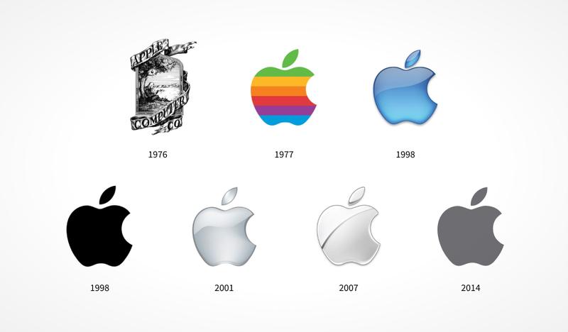
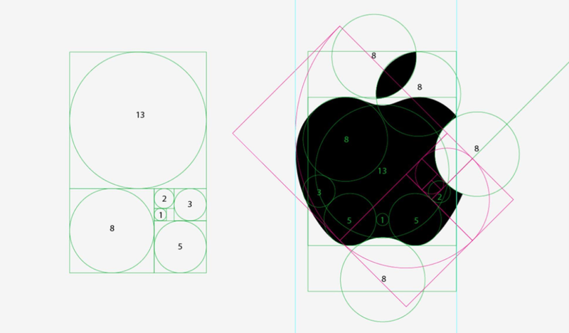
Now let's take a look at the Apple logo from a designer’s perspective. Over the forty years of the Apple logo evolution, the only thing that experienced transformations to match the company's current marketing strategy is the color scheme. The logo’s strict geometric proportions which some people claim adhere to the Golden Ratio, have remained unchanged. Apple’s thoughtful branding resulted in an iconic, timeless symbol. Times change, new trends emerge every second, but the simplicity of the Apple logo always makes it stand out. There’s hardly anything you can change about it, but you wouldn’t even want to, because it’s perfect the way it is.
2. Google
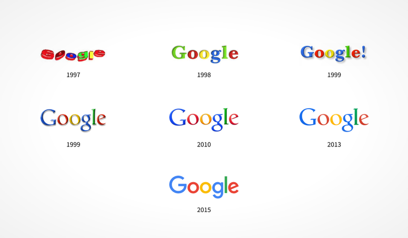
For a smart high-tech company with a history that dates back to 1998, Google sure knows how to come up with strange logo solutions. Google logo history begins with the outdated Antiqua font on the old Google logo that looked grotesque even back then. What made this logo easier on the eye was the colorful palette, and thankfully the colors were left unchanged on the new Google logo. The logo definitely looks more modern and up-to-date now.
Another recent development for Google is the introduction of an icon shaped like a letter "G". Just like the Apple logo, it uses strict but harmonious geometric proportions.
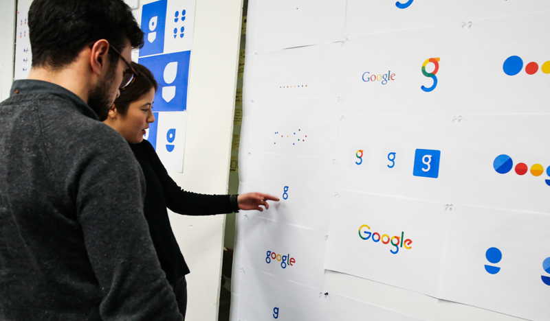
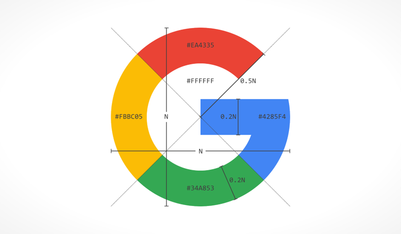
It is possible that in the future the company will upgrade the design without changing the outline of the logo. If you want to learn more about inspiring design ideas, check out our graphic design services.
3. Microsoft
Microsoft and Apple have always been fierce rivals, and they chose completely different ways to outdo each other. Microsoft logo evolution demonstrates that you can follow your own path until you’ve found a successful solution for your logo. At first, the company tried to keep up with the times by changing Microsoft’s old logo every few years. In 1987, the company once again created a new logo that was kept unaltered for twenty-five years. With this logo, Microsoft experienced its heyday and turned into an empire it is now. Designed using the most recognizable font - Helvetica, Microsoft logo remains as relevant as ever.
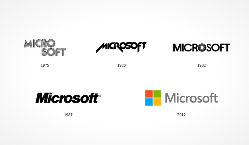
For a long time, Microsoft’s marketing efforts had been focused on Windows. In 2012, the styles of Microsoft and Windows have finally merged. The company logo is now written in a more modern font, and the sign has turned into a static square shape divided into four parts. The dynamics present in the original style have disappeared. The sign itself ceased to symbolize the “window” and came to represent the group of companies and products that Microsoft offers. Remember that your logo is only part of your company's brand identity. Successful online presence is defined not only by a good logo, but also by quality web design.
As a huge global brand, Microsoft can afford to capture a simple square divided into parts as an identifying feature. Such a simple design allows for a long, fruitful existence on the market. The only weakness of the Microsoft logo is lack of uniqueness that undermines its influence in the eyes of their rivals like Apple or IBM.

4. Coca-Cola
Coca-Cola is one of the oldest companies on the market, and the iconic Coca-Cola logo is just as old. Having acquired its first recognizable features in 1900, Coke logo has remained virtually unchanged for over a hundred years.
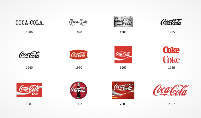
The only time the company chose to move away from its old corporate identity in 1985, it paid a big price. The backlash against the new Coca-Cola logo font was huge, and the company had to restore its original brand style. This unfortunate incident in the Coca-Cola logo history demonstrates the power of the main identifying feature of every design - company name that is better left untouched. Considering the fact that calligraphy and lettering are gaining popularity again, Coca-Cola, with its famous timeless logo, stays ahead of the game.
5. Amazon
Amazon logo is a relatively young and has a short, but fascinating history. This company is a very interesting case as we can trace the Amazon logo evolution back from the humble design with the aquatic background to the powerful brand strategy it uses now.
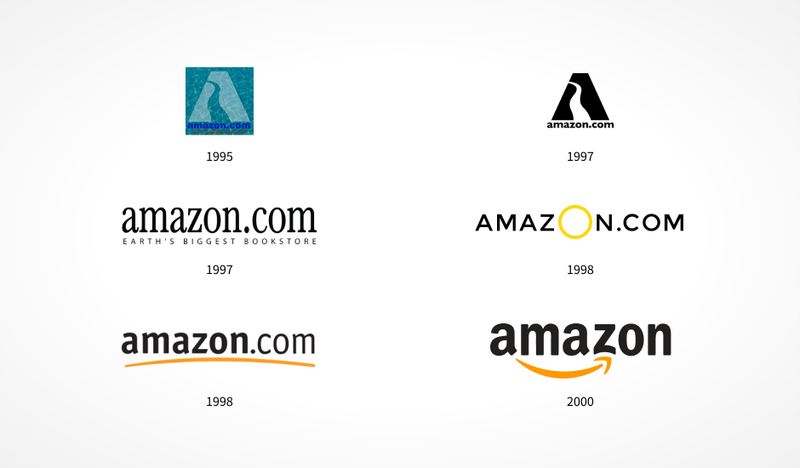
At first, in order to represent the endless flow of books from the Amazon river of the store, they created a logo with aquatic imagery to match their brand identity. After the company started to expand its market, it became apparent that it was time to pick a new direction. Three years later, the solution was found.
At the time, no company logos attempted to directly appeal to the emotions of their customers and send a convincing message: “We are friendly and approachable”, or “We will be happy to deliver all the products you need”, and so on. A truly revolutionary solution had been achieved by simply switching to lowercase letters and adding a yellow arrow from “a” to “z”. Amazon logo is easy to work with - you can add new concepts and ideas to it later as long as the arrow and the black letters remain unchanged.
6. Facebook
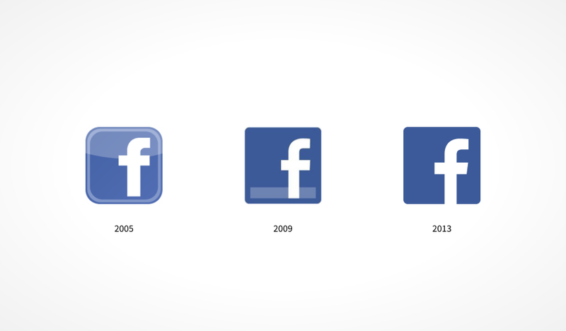
The Facebook logo belongs to a young and already legendary company, so it makes sense that its history is rather short. Facebook logo evolution has only ever seen two different styles: two concepts corresponding to the contemporary design trends and each of them is great in its own way. So, Facebook logo history is rather short.
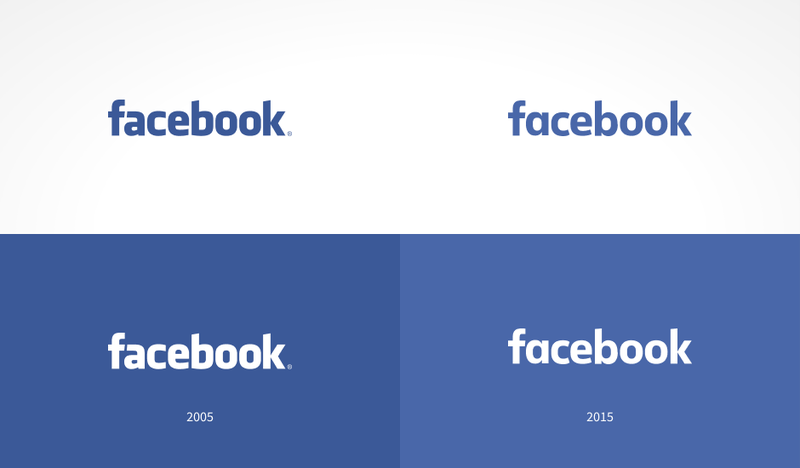
The only thing worth noting is that Facebook was one of the first companies to use the lowercase font, creating a casual, laid-back vibe. Facebook logo font was custom designed by Joe Kral, who accomplished it by using the letterforms of the Klavika Bold font. Perhaps even more celebrated than the Facebook logo is the company’s icon symbol. It has seen more changes than the logo, mostly due to constant user interface redesign. In general, the design of the icon is very simple and identifiable, and for a company like Facebook, brand recognition is everything.
7. IBM
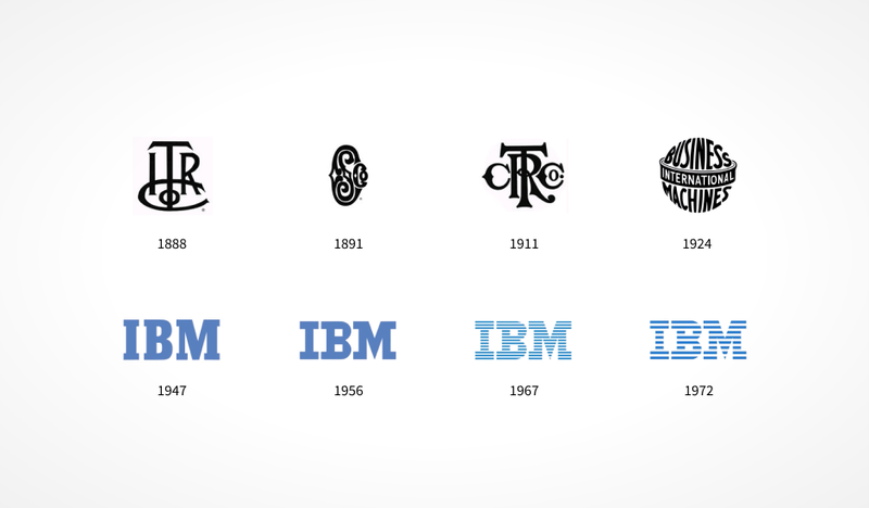
One of the oldest companies on the list is IBM, also known as Big Blue. The company developed one of the most identifiable logos in the world, which is now over sixty years old. The three simple letters “IBM” made their first appearance in 1956, as you can see in the images of logos below. In 1972, they finalized their logo and it remained unchanged to this day. IBM logo is considered to be a turning point in the history of logo design. Thanks to IBM and the designer Paul Rand, companies have become aware of how much influence the logo can have on brand development and started thinking about the quality of logo design. Let's take a closer look at IBM logo history. Initially, the letters looked heavy and monumental, to match the company’s public image of an indestructible giant. However, it wasn’t enough. IBM needed the logo to display the agility and versatility of both its products and the company itself. Once again, the ingenious solution was found by Paul Rand, who painted IBM’s old logo blue and added horizontal stripes to represent dynamism and speed but without losing its solid appearance. Such a bold move made the logo stand out. All the subsequent attempts by other businesses to repeat the idea with the lines only prove the originality of the logo. The result is evident: IBM’s new logo is the only one in the world, perfectly designed and precisely remastered to represent a company everyone can identify right away.
8. GE
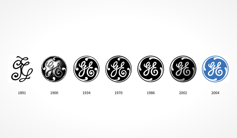
IBM is followed by another giant - GE (General Electric), that has one of the oldest logos. Hard to imagine that the creative design of the General Electric logo was created almost 130 years ago. A few years after the company was established, their designers came up with a circular shape for it and the logo hasn’t really changed ever since - staying true to its stable business and style. Still, as we can see on the picture below, GE logo history left some space for minor modifications. Please note that even large industrial companies follow contemporary trends in design. As we’ve already pointed out, true leaders must keep up with the times. Although created over a hundred years ago, the GE logo look is fairly modern due to its agility and elaborate design.
GE's new logo perfectly matches the company’s visual identity, but can you say the same thing about your logo? Look at your company logo and answer the following questions: Is my logo made by professionals? Does it have a strong concept behind it? Is the logo effective and up-to-date? Read more about the answers to these questions in our article Logo Design Importance.
9. McDonalds
McDonalds’ Golden Arches logo is one of the most iconic brand logos of all time. Together with Coca-Cola, McDonalds has the most easily recognizable logos in the world, and not only by fast food lovers. What makes the McDonald’s logo special? Just like in every other case, it’s two things: originality and simplicity. Before appearing on McDonald’s first logo, the Golden Arches first appeared in the design of the restaurant’s buildings. It wasn’t until 1961 that Jim Schindler, the company’s expert in construction and equipment, developed a new logo by connecting the two arches and getting the shape of the letter "M".
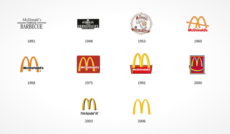
The old McDonald’s logo from 1961 also features the sloping line of the restaurant's rooftop, which is later excluded from the logo design. Turns out there is no secret behind the McDonald’s logo meaning. In 1968, the familiar signature letter "M" made its first appearance. Since then, the shape of the logo has never really changed, although designers add various elements to the letters, depending on the current visual trends. However, we should note that it is brands like McDonalds that don’t necessarily pioneer new trends, but rather act as a driving force for visual culture. We have already found out earlier that concise, simple solutions usually have no drawbacks, and the McDonald’s logo is no exception. The Golden Arches speak one language with the entire world.
10. Disney
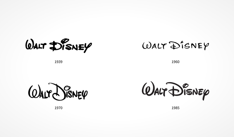
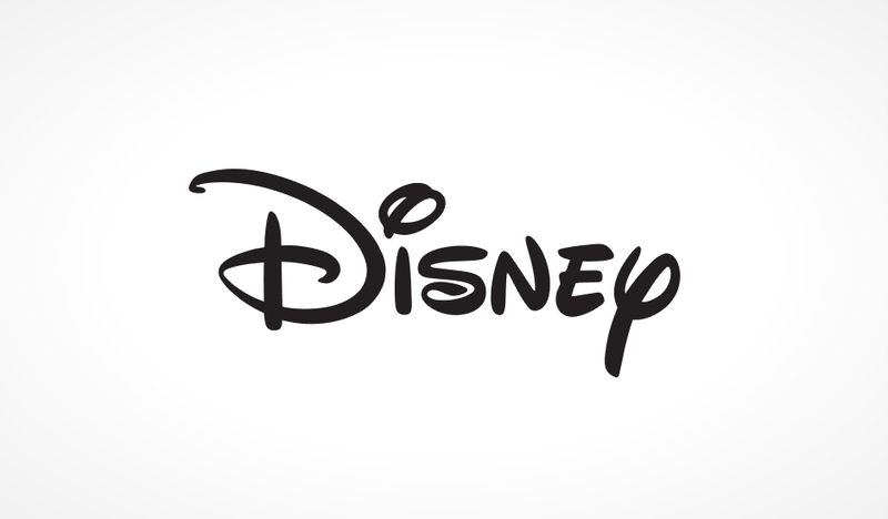
The magical Disney logo is something all of us have been familiar with since we were kids. The company creator Walt Disney’s signature (allegedly) has become the Disney logo font. The Walt Disney logo history begins with this distinctive font. The famous Cinderella castle and the arch in the form of a shooting star that appears above it are a surprisingly recent addition to the logo.
It is difficult to talk about the quality of design here, but we can clearly see how the logo changes over time and how the designers have been consistently refining and perfecting it. One slight alteration after another, the Walt Disney logo will continue to keep current with the times without losing the ingenuity of its legendary creator.
Conclusion
We’ve discussed top 10 company logos of the world's richest brands. Ten completely different logos, each with its own history. Some of them have been altered and updated many times, others managed to come up with a creative logo design right off the bat. What they all share in common is a professional approach, attention to detail and staying current with the times.
Looking for some logo design inspiration? Need a free consultation? Send us your current logo, a link to your website or a brief description of your company and its core values. We can offer various modern logo design ideas, or perhaps we’ll simply reassure you that your logotype is great as it is.



Comments
Hii
Your article is really very informative and attractive too. I like the way you describe each and everything. Keep sharing these kinds of article.
Thanks for sharing this marvellous post. I m very pleased to read this article. I enjoy this site – its so useful and helpful.